Zocdoc
Simplifying Healthcare Access for Patients
- 📄 Project Name: ZocDoc Mobile Booking Platform
- 🕒 Year: 2021
- 👤 Role: UX Designer
- 🛠 Tools: Figma
Transforming Doctor Discovery
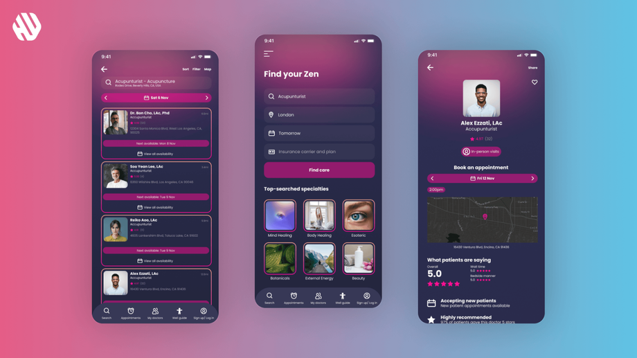
Redesigned the mobile booking experience – streamlined doctor searches led to a 29% increase in successful bookings.
Understanding the Healthcare Navigation Challenge
Finding the right doctor can feel overwhelming for patients, often leading to frustration and disengagement. ZocDoc recognized that many users struggle with an abundance of options, making it difficult to discern which healthcare providers best suit their needs. Additionally, concerns over the authenticity of reviews and cumbersome booking processes contribute to user dissatisfaction.
The primary aim of this project was to simplify the doctor discovery and booking process. From a business perspective, ZocDoc wanted to enhance user engagement and increase the conversion rate for bookings. From the user's perspective, the goal was to create a seamless experience that reduces the time and effort required to find and book appointments with trusted healthcare professionals.
Goals:
- Simplify the search process for doctors.
- Enhance trust in reviews by filtering for authenticity.
- Streamline the booking process to reduce user effort.
Researching User Needs
🔍 Research
To understand user frustrations and preferences, I conducted a combination of user interviews and surveys. I engaged with 35 participants, gathering insights on their experiences with existing healthcare booking platforms. Key findings revealed significant pain points around choice overload, distrust in reviews, and a complex booking process that deterred users from completing appointments.
Key Findings:
- Users felt overwhelmed by the number of available options.
- Many expressed skepticism regarding the reliability of online reviews.
- The booking process was often viewed as tedious and time-consuming.
✍️ Synthesis
I synthesized the research findings by identifying core themes that emerged from user feedback. I created user personas that represented typical patients, highlighting their goals, frustrations, and behaviors. Additionally, I mapped out the user journey to pinpoint critical touchpoints where the experience could be improved. This synthesis allowed me to define opportunities for enhancing the overall user experience.
🎨 Design
My design approach focused on ideation and rapid prototyping. I sketched multiple wireframes to explore various layouts that could facilitate easier navigation and booking. After creating initial prototypes, I gathered feedback from potential users through usability tests, iterating on the design based on their suggestions. This iterative process ensured that the final design was user-centered and addressed the identified pain points effectively.
🚀 Outcome
The final mobile booking platform featured a simplified search interface that allowed users to filter doctors based on specific criteria, such as specialties and ratings. The review section was revamped to highlight verified feedback, ensuring users could trust the information provided. The booking flow was streamlined, enabling users to schedule appointments with minimal effort, ultimately making the process as easy as ordering pizza.
Rationale Behind Design Decisions
The design decisions were guided by the insights gathered during the research phase. For instance, the simplified search feature was implemented to combat choice overload, allowing users to find relevant doctors quickly. The emphasis on authentic reviews stemmed from user feedback expressing distrust towards generic ratings. By enhancing the booking process, I aimed to alleviate the frustration users felt when interacting with previous platforms.
I also considered usability constraints, such as ensuring the design was mobile-friendly and accessible to a diverse user base. Stakeholder input emphasized the importance of a quick and enjoyable user experience, which further reinforced my design choices.
Measurable Impact and Feedback
The redesigned mobile booking platform yielded impressive results, demonstrating significant improvements in user engagement and satisfaction.
Outcomes:
- 29% increase in successful bookings.
- 42% reduction in user drop-off during the booking process.
- 88% of users reported a more enjoyable experience compared to previous platforms.
- Qualitative feedback highlighted users' appreciation for the streamlined process and trustworthy reviews.
By creating a user-friendly platform, I successfully transformed the way patients interact with healthcare services, making the experience more enjoyable and efficient.


