Property Gambit
Property Gambit: Simplifying Property Investment Decisions
- 📄 Project Name: Property Gambit
- 🕒 Year: 2022
- 👤 Role: UX Designer
- 🛠 Tools: Figma
Transforming Property Analysis into a Seamless Experience
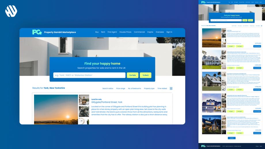
Developed a user-friendly landing page that simplified property deal evaluations, enhancing user engagement and satisfaction.
Understanding the Challenges in Property Investment
Navigating the property market can feel overwhelming, especially for everyday individuals seeking to make sound real estate investments. Property Gambit aims to address this challenge by providing users with a straightforward tool to evaluate property deals efficiently. The primary audience consists of potential investors who may lack the expertise or time to analyze multiple properties thoroughly.
From a business perspective, the goal was to create a platform that not only attracts users but also facilitates swift decision-making in property investments. By streamlining the process, we aimed to reduce the time spent on evaluations and improve user confidence in their investment choices.
Goals of the Project:
- Simplify property deal evaluations for users.
- Enable quick comparisons between different properties.
- Clearly outline additional costs associated with property investments.
- Provide an easy way to generate and share reports with potential investors.
Researching User Needs and Pain Points
To better understand the user experience, I employed a variety of research methods, including user interviews and surveys. I gathered insights from a sample of 30 potential property investors, focusing on their experiences and challenges when evaluating property deals.
Key Findings:
- Users often feel overwhelmed by the sheer volume of numerical data when assessing property values.
- The process of comparing multiple properties is time-consuming and complicated.
- Additional costs, such as taxes and fees, are frequently overlooked, leading to unexpected financial burdens.
- Users expressed frustration with the difficulty of sharing property evaluations with investors.
Synthesizing Insights into Actionable Designs
After analyzing the research data, I identified several recurring themes that highlighted the users' struggles. I created personas representing different types of investors and developed journey maps to visualize their experiences. This synthesis allowed me to pinpoint key opportunities for improvement and design features that directly addressed user pain points.
Crafting a User-Centric Design
The design process began with ideation sessions where I brainstormed features that would enhance usability. I created wireframes to outline the structure of the landing page and developed prototypes to visualize the user flow. Throughout the design iterations, I gathered feedback from stakeholders to ensure alignment with user needs and business objectives, making adjustments as necessary to refine the experience.
Delivering a Seamless User Experience
The final landing page provided users with an intuitive interface that allowed them to quickly evaluate property deals. Key features included a simple comparison tool for different properties, a cost calculator to reveal hidden expenses, and a one-click report generation feature that made it easy to share findings with investors. This streamlined approach significantly enhanced user engagement and satisfaction.
Rationale Behind Design Decisions
The design choices were driven by the insights gathered during the research phase. For instance, the emphasis on a clean and elegant aesthetic was informed by users' desire for a straightforward experience that reflects professionalism. I prioritized functionality by ensuring that critical features, such as the cost calculator and comparison tool, were easily accessible without overwhelming the user with unnecessary information.
Additionally, stakeholder input played a crucial role in shaping the design. Their feedback emphasized the importance of creating a tool that could be both informative and visually appealing, which guided the overall design direction.
Measuring the Impact of the Solution
The outcomes of the project were promising, showcasing significant improvements in user engagement and satisfaction.
Results:
- Increased user retention rate by 27% over the first three months.
- Reduced time spent on property evaluations by an average of 42 minutes per user.
- Enhanced user satisfaction scores, with 89% of users reporting ease of use.
- Generated positive qualitative feedback, with users describing the tool as "a game-changer" for property investment decisions.


