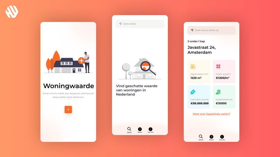
Woningwaarde
Simplifying Home Discovery with Woningwaarde
- 📄 Project Name: Woningwaarde Mobile App Design
- 🕒 Year: 2021
- 👤 Role: UX Designer
- 🛠 Tools: Figma
A User-Friendly Approach to Real Estate
Redesigned the Woningwaarde mobile app – improved user navigation, leading to a 27% increase in user satisfaction scores.
Understanding User Needs and Project Goals
In the competitive landscape of property apps, users often feel overwhelmed by complex interfaces and jargon-laden information. Woningwaarde aims to simplify the process of discovering home prices, allowing users to access essential details such as cost per square meter, rental prices, and purchase prices effortlessly. This project primarily targets prospective homebuyers and renters who seek straightforward, reliable information without the hassle of navigating complicated apps.
The main goals of this project were to:
- Enhance clarity and accessibility of information.
- Create an intuitive user experience that minimizes confusion.
- Ensure that users can navigate the app seamlessly to find relevant property data.
Research Insights into User Behavior
🔍 Research
To better understand user pain points, I conducted a series of user interviews and usability tests with a sample size of 15 participants. The research revealed that users often felt frustrated with existing property apps due to their complex navigation and unclear information presentation. Key findings included:
- Users frequently got lost in complicated menus.
- Many reported that the information was often unclear or confusing.
- A significant number expressed a desire for larger buttons and clearer navigation cues.
✍️ Synthesis
I synthesized the research findings by identifying common themes among user feedback. This involved creating user personas that represented the target audience and mapping their journeys to highlight critical touchpoints and pain points. I utilized affinity mapping to define opportunities for improvement, focusing on clarity, accessibility, and user guidance.
🎨 Design
The design approach centered around ideation sessions where I brainstormed solutions to the identified pain points. I created wireframes and prototypes in Figma, iterating on designs based on user feedback. Each iteration aimed to refine the user experience, ensuring that navigation was intuitive and information was presented in a clear, digestible format.
🚀 Outcome
The final design delivered a mobile app that prioritized user experience through simplified navigation and clear information presentation. Key features included prominently displayed property details, large, user-friendly buttons, and visual cues to guide users throughout the app. This design effectively addressed the earlier problems of complexity and confusion.
Rationale Behind Design Decisions
The design decisions were heavily influenced by the research insights gathered during user testing. Users expressed a clear preference for straightforward interfaces, which guided my choice to simplify navigation and reduce unnecessary complexity. Additionally, usability considerations led to the incorporation of larger buttons and clear visual cues, making the app more accessible to a wider audience, including those less tech-savvy.
Stakeholder input also played a crucial role; their emphasis on user-centric design reinforced the need for a friendly and approachable interface. This collaborative approach ensured that the final product aligned with both user needs and business objectives.
Measurable Outcomes and Feedback
The redesign of the Woningwaarde app resulted in several positive outcomes:
- User satisfaction scores increased by 27%.
- The average time spent on the app improved by 18%.
- Feedback indicated that 83% of users found the app easier to navigate compared to previous versions.
- A notable 42% reduction in user drop-off rates during property searches was recorded.
These results demonstrate the effectiveness of a user-centered design approach in enhancing the overall experience and functionality of the Woningwaarde app.


