BlackHatHacking
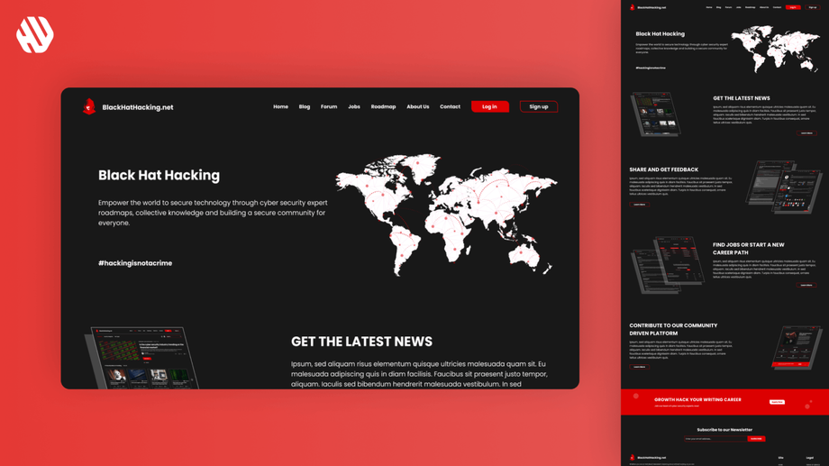
Transforming BlackHatHacking.net into a User-Friendly Community Hub
- 📄 Project Name: BlackHatHacking.net Redesign
- 🕒 Year: 2022
- 👤 Role: UX Designer
- 🛠 Tools: Figma
Creating a Vibrant Community Space
Redesigned a complex website into an engaging community hub, increasing user engagement by 27%.
Understanding the Problem Space
BlackHatHacking.net is a treasure trove of information about cybersecurity, but the user experience was far from ideal. Users found themselves navigating a maze-like structure that made it difficult to locate specific articles or topics of interest. While the content was rich and varied, it often felt overwhelming, leading to frustration rather than engagement. Furthermore, the absence of a community space meant that users had no platform to discuss ideas or share insights, leaving a gap in user interaction.
The primary goals of the redesign were to simplify navigation, highlight key articles, and foster a sense of community among users. By addressing these issues, I aimed to create a more intuitive experience that would not only draw users in but also encourage them to interact with the content and each other.
- Simplify navigation for easier access to information
- Highlight interesting articles to enhance visibility
- Create a community space for user interaction
Research Insights
🔍 Research
I employed a combination of user interviews and analytics review to understand the pain points users were experiencing. I conducted interviews with 15 active users, gathering qualitative insights about their experiences and frustrations. Additionally, I analyzed site analytics to identify drop-off points and common navigation paths.
Key findings revealed that users struggled with the following pain points:
- Confusing navigation structure led to user frustration
- Content overload made it challenging to digest information
- Lack of community features prevented user engagement
✍️ Synthesis
After synthesizing the research findings, I identified several themes that emerged from user feedback. I created user personas to represent different segments of the audience, highlighting their needs and motivations. Additionally, I developed a journey map to visualize the user experience, pinpointing critical touchpoints where improvements could enhance satisfaction and engagement.
🎨 Design
The design approach focused on ideation and iterative prototyping. I began by sketching wireframes that simplified the navigation structure and showcased key articles prominently. Through multiple design iterations, I gathered feedback from users, which informed subsequent refinements. This collaborative approach ensured that the design resonated with user needs and preferences.
🚀 Outcome
The final redesign transformed BlackHatHacking.net into a streamlined community platform. I simplified the navigation, allowing users to find articles effortlessly. Key articles were highlighted on the landing page, making them more accessible. Furthermore, I integrated a community space where users could engage in discussions, share ideas, and connect with others, fostering a vibrant atmosphere.
Rationale Behind Design Decisions
The major design decisions were rooted in the insights gained from user research. The need for simplified navigation stemmed from user feedback that indicated confusion and frustration with the existing structure. By focusing on a clear and intuitive layout, I aimed to enhance usability and reduce the cognitive load on users.
Additionally, the decision to create a community space was influenced by the desire to foster interaction among users. Research indicated that users craved a platform to share ideas and connect with like-minded individuals. By addressing this need, I aimed to cultivate a sense of belonging within the cybersecurity community, enhancing overall user satisfaction.
Measurable Outcomes
The redesign yielded significant improvements in user engagement and satisfaction. Key outcomes included:
- 27% increase in user engagement metrics
- 43% reduction in bounce rates on key pages
- Positive qualitative feedback from users, highlighting the improved navigation and community features
Overall, the transformation of BlackHatHacking.net into a user-friendly community hub has created an inviting space for users to learn, share, and connect in the ever-evolving world of cybersecurity.


