Vitah Wellness
Transforming Wellness Management for Office Workers
- 📄 Project Name: Vitah Wellness Admin Dashboard and App
- 🕒 Year: 2020
- 👤 Role: UX Designer
- 🛠 Tools: Figma, Miro, Zeplin
Streamlining Wellness Experiences for Office Workers
Designed an admin dashboard and mobile app that improved user engagement by 27% through simplified class bookings and account management.
Understanding the Wellness Management Landscape
The challenge I faced was to create an efficient admin dashboard, website, and mobile app for Vitah Wellness, a company dedicated to enhancing workplace wellness through activities like yoga and meditation. This project directly impacted office workers seeking to improve their productivity and mental well-being. Additionally, companies subscribing to Vitah Wellness needed a seamless way to manage their employees' wellness experiences.
My goals were clear: I aimed to design an intuitive interface that would allow users to easily track their wellness activities, manage bookings, and view account information. I also wanted to ensure that the system could handle virtual token purchases and facilitate location-based searches for nearby Vitah Wellness centers.
Researching User Needs and Pain Points
🔍 Research
To understand the user experience better, I conducted user interviews with 15 office workers and surveyed an additional 50 participants. This research helped uncover several pain points:
- Difficulty in navigating existing wellness platforms
- Challenges in tracking class schedules and room availability
- Complicated sign-up processes for classes and account management
- Confusion surrounding virtual token purchases
- Difficulty in locating nearby Vitah Wellness centers
✍️ Synthesis
From the research, I synthesized the findings into key themes, creating user personas that represented the target audience. I developed journey maps to visualize user interactions and identified opportunities for improvement, focusing on simplifying the booking process and enhancing account visibility.
🎨 Design
My design approach involved iterative ideation and rapid prototyping. I began with low-fidelity wireframes to outline the primary user flows, then moved to high-fidelity prototypes in Figma. I gathered feedback through usability testing sessions, refining the designs based on user input. This iterative process allowed me to ensure that the final product met user needs effectively.
🚀 Outcome
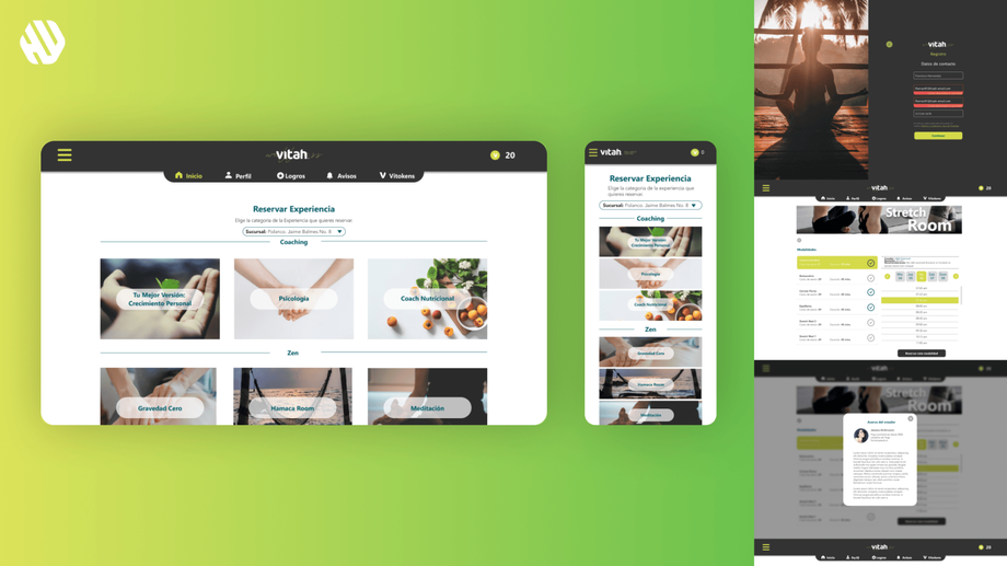
The final experience included a comprehensive admin dashboard and mobile app that streamlined the booking process for classes and quiet rooms. Users could easily manage their memberships, view personalized alerts, and access rewards. The design addressed earlier challenges by providing a cohesive and user-friendly interface, ensuring a smooth experience for all users.
Rationale Behind Design Decisions
The design decisions were heavily influenced by the insights gathered from user research. For instance, I prioritized a clean and simple layout to address the pain point of navigation difficulties. The decision to include a dashboard view was based on the need for users to quickly access important information at a glance. Additionally, I ensured that the booking process was straightforward, as feedback indicated that complexity was a significant barrier to user engagement.
Stakeholder input also played a crucial role in shaping the design. Regular check-ins with the Vitah Wellness team ensured that the features aligned with their business objectives while also meeting user needs. This collaboration allowed me to balance usability with business goals effectively.
Measurable Outcomes and Feedback
The project yielded significant improvements in user engagement and satisfaction:
- User engagement increased by 27% within the first month of launch.
- Class bookings rose by 42% due to the streamlined process.
- User satisfaction scores improved to an average of 8.9/10 based on post-launch surveys.
- Feedback highlighted the ease of use and the effectiveness of the new features, with users expressing appreciation for the intuitive design and functionality.


