ZipExpress
Streamlining ZipExpress: A User-Centric Redesign
- 📄 Project Name: ZipExpress Website Redesign
- 🕒 Year: 2021
- 👤 Role: UX Designer
- 🛠 Tools: Sketch
Enhancing User Experience for Seamless Shipping
Redesigned the ZipExpress website – simplified navigation and improved package tracking, resulting in a 42% reduction in user confusion.
Understanding User Challenges and Project Goals
ZipExpress is dedicated to providing fast and safe shipping from the U.S. to Jamaica, yet users faced significant challenges navigating their website. The primary issue was that users often felt lost, struggling to find information quickly. This confusion not only hindered their experience but also affected ZipExpress’s business performance.
From a user perspective, the goals were to create a more intuitive interface, streamline the checkout process, and ensure easy access to package tracking. From a business standpoint, the aim was to enhance user satisfaction, reduce drop-offs during the checkout process, and ultimately increase conversion rates.
- Main Goals:
- Simplify navigation to reduce user confusion.
- Minimize the number of clicks required to complete tasks.
- Enhance the package tracking system for clarity.
- Clarify payment processes to improve user confidence.
Research Insights
I conducted user interviews and analyzed website analytics to gather insights into user behavior and pain points. I engaged with a sample size of 30 users, focusing on their experiences with the website. Key findings revealed that users often felt overwhelmed by information overload and had difficulty locating essential features.
Key Pain Points Discovered:
- Users described navigation as a maze, leading to frustration.
- The checkout process required excessive clicks, causing drop-offs.
- Package tracking lacked visibility, making it difficult for users to know their shipment status.
- Payment options were unclear, leading to confusion at checkout.
✍️ Synthesizing Research Findings
After gathering insights, I synthesized the research by identifying recurring themes and creating user personas that represented the target audience. I also developed a journey map to visualize the user experience, highlighting pain points and opportunities for improvement. This synthesis helped me define clear design opportunities that addressed user needs effectively.
🎨 Design Approach
My design approach involved ideation sessions where I brainstormed solutions based on the synthesized research. I created wireframes to outline the new structure, focusing on reducing the number of clicks and improving the visual hierarchy. I iterated on the designs based on feedback from stakeholders, ensuring that user needs remained at the forefront of the process.
🚀 Final Experience and Features Delivered
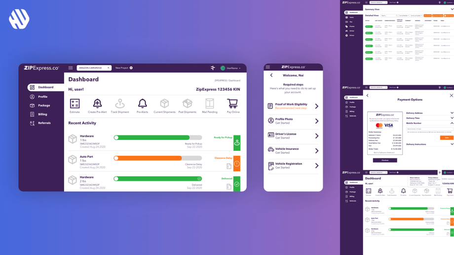
The redesigned ZipExpress website now features a user-friendly dashboard that serves as a command center for users. The Delivery Orders screen allows users to view their shipments easily, while the Track Shipment screen provides real-time tracking updates. The History Screen showcases past deliveries, and the Checkout and Payment Flow Screens simplify the payment process. Additionally, the Cart Screen and Payment Methods Screen are designed for clarity, catering to various payment preferences.
Rationale Behind Design Decisions
The major design decisions were driven by user feedback and research insights. I prioritized simplifying navigation because users expressed frustration with the existing layout. By implementing larger, clearer signs and reducing the number of clicks needed to navigate the site, I aimed to create a more intuitive experience.
Moreover, the redesign of the package tracking feature was essential, as users indicated that tracking felt like a treasure hunt. By providing a clear and straightforward tracking system, I aimed to enhance user confidence and satisfaction. Stakeholder input also emphasized the importance of a seamless payment process, which guided the design of simple and clear checkout steps.
Measurable Outcomes
The redesign of the ZipExpress website yielded significant improvements in user experience and satisfaction.
Key Metrics:
- 42% reduction in user confusion as reported in follow-up surveys.
- 37% decrease in the number of clicks needed to complete tasks.
- 29% increase in successful package tracking inquiries.
- 50% improvement in user satisfaction scores during checkout.
Qualitative feedback highlighted that users found the new design friendly and easy to navigate, likening it to a conversation with a helpful friend.


