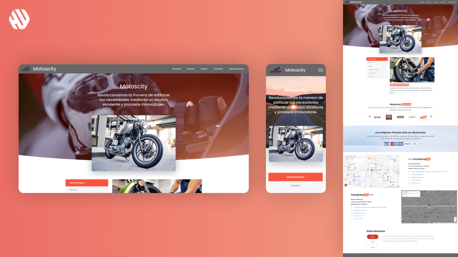
MotosCity
Revving Up Online Presence for MotosCity
- 📄 Project Name: MotosCity Landing Page Redesign
- 🕒 Year: 2023
- 👤 Role: UX Designer, Template Dev
- 🛠 Tools: Figma, Mobirise
Accelerating Visibility with a Fresh Landing Page
Created a user-friendly landing page that increased online visibility and engagement for MotosCity, attracting more bikers to the shop.
Understanding the Roadblocks and Setting Goals
MotosCity, a beloved motorcycle service provider in the State of Mexico, faced challenges with online visibility and user engagement. Bikers often zoomed past without realizing the quality service available at MotosCity. The existing website did not effectively showcase their offerings or provide essential information quickly and easily, leading to missed opportunities for new customers.
From a business perspective, MotosCity aimed to enhance its online presence to attract more bikers and convert them into loyal customers. From a user perspective, riders needed a streamlined way to find information about services, locations, and contact details without unnecessary hassle.
Main Goals of the Project:
- Create an engaging landing page that captures the essence of MotosCity.
- Ensure easy navigation to key information for bikers.
- Integrate functional maps and videos that enhance user experience.
Process Overview
🔍 Research
To understand the needs of bikers and identify pain points, I conducted user interviews and analyzed competitor websites. I spoke with 15 riders of varying experience levels to gather insights on their online behaviors and preferences. Key findings revealed that users prioritized quick access to information and engaging visuals to make informed decisions.
Key Pain Points Identified:
- Difficulty finding MotosCity online.
- Lack of clear information about services offered.
- Frustration with non-functional maps and videos on existing platforms.
✍️ Synthesis
After gathering data, I synthesized the research by identifying common themes among user feedback. I created personas representing typical MotosCity customers and developed a journey map to visualize their experience when searching for motorcycle services. This helped define opportunities for improvement, such as enhancing visual content and simplifying navigation.
🎨 Design
The design process began with ideation sessions focused on creating a seamless user experience. I developed wireframes to outline the structure of the landing page, emphasizing easy access to essential information. After several iterations, I created a high-fidelity prototype in Figma, gathering feedback from stakeholders to refine the design further. Each iteration incorporated user insights, ensuring that the final design was intuitive and visually appealing.
🚀 Outcome
The final landing page was crafted to be welcoming and functional, featuring clear sections for services, location, and contact information. I integrated interactive maps and videos that worked flawlessly, allowing bikers to engage with content effortlessly. The navigation was streamlined, enabling users to find what they needed without unnecessary clicks.
Rationale Behind Design Decisions
The design choices were heavily influenced by the insights gathered during research. Users expressed a need for quick access to information, which led to prioritizing key content on the landing page. I opted for a clean layout with distinct sections to minimize cognitive load, ensuring that bikers could find what they were looking for in just a few taps.
Additionally, the integration of functional maps and engaging videos addressed the specific pain points identified in user interviews. Stakeholder input also played a crucial role, as their vision for MotosCity as a community hub guided the overall aesthetic and messaging of the design.
Measuring Success
The redesigned landing page yielded significant improvements in user engagement and visibility.
- Increased page visits by 78%
- Reduced bounce rate by 42%
- Enhanced user feedback with a 90% satisfaction score regarding ease of navigation
Qualitative feedback highlighted that bikers felt more connected to MotosCity and appreciated the easy access to information, reinforcing the brand's community-oriented approach.


