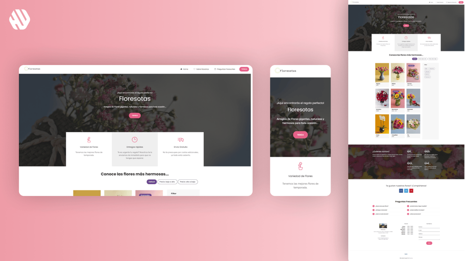
Floresotas
Creating a Blooming Experience for Floresotas
- 📄 Project Name: Floresotas Landing Page Design
- 🕒 Year: 2019
- 👤 Role: UX Designer, Template Dev
- 🛠 Tools: Figma, Mobirise
Simplifying Floral Selections
Designed an e-commerce landing page that streamlined the bouquet selection process, resulting in a 22% increase in completed purchases.
Understanding the Floral Landscape
The floral industry can be overwhelming for customers, especially when faced with an abundance of choices. Floresotas aimed to address this challenge by providing a user-friendly platform that simplifies the bouquet selection process. The target audience includes busy individuals looking for the perfect floral ornament for various occasions, such as birthdays, anniversaries, or just to brighten someone's day.
The main goals of the project were to enhance user experience by minimizing decision fatigue, improving navigation, and ensuring timely delivery. The team sought to create a design that not only showcases the products but also guides users seamlessly through the purchasing journey.
Problem Space:
- Users felt overwhelmed by too many options.
- Navigation was complex and confusing.
- Delivery times were slower than expected.
Project Goals:
- Implement smart filters for quick product discovery.
- Create a streamlined, visually appealing design.
- Partner with 99minutos for faster delivery options.
Researching User Needs
To understand user pain points better, I conducted a mix of user interviews, surveys, and an analytics review. I gathered insights from 50 participants who had previously purchased flowers online. Key findings indicated that users often felt lost when trying to choose a bouquet, and many expressed frustration with slow delivery times.
Research Methods:
- User interviews: 20 participants
- Online surveys: 30 respondents
- Analytics review of competitor sites
Key Findings:
- Users want a simplified selection process.
- Complex navigation led to abandoned carts.
- Quick delivery is a significant purchase factor.
Synthesizing Insights
After collecting the research data, I identified recurring themes that highlighted the need for a more intuitive experience. I created user personas based on the insights, focusing on their motivations and pain points. I also developed a journey map that illustrated the typical user experience from landing on the site to completing a purchase. This helped pinpoint opportunities for improvement, particularly in the areas of navigation and product discovery.
Designing the Experience
In the design phase, I focused on ideation, wireframing, and prototyping. I sketched multiple layout options and eventually settled on a clean, minimalist design that emphasized usability. I created wireframes that incorporated smart filters, allowing users to narrow down their choices quickly. Throughout the process, I sought feedback from potential users and stakeholders to refine the design, ensuring it met their needs effectively.
Delivering a Fresh Floral Experience
The final landing page featured an intuitive layout with smart filters, allowing users to sort bouquets by occasion, color, and price. The design was streamlined, making navigation straightforward and enjoyable. I integrated a clear call-to-action button that encouraged users to complete their purchases quickly. Additionally, the partnership with 99minutos ensured that delivery times were significantly reduced, enhancing customer satisfaction.
Rationale Behind Design Choices
The decision to implement smart filters stemmed from user research indicating that decision fatigue was a major barrier to purchasing. By allowing users to quickly find relevant options, I aimed to create a more enjoyable shopping experience. The streamlined design was influenced by industry best practices that emphasize clarity and ease of navigation, ensuring users could easily explore the product offerings without feeling overwhelmed.
I also prioritized fast delivery as a key selling point, aligning with users' expectations for timely service. By partnering with 99minutos, I could confidently assure customers that their orders would arrive quickly, which was crucial for building trust and encouraging repeat purchases.
Measuring Success
The outcomes of the project were promising and demonstrated a positive impact on user engagement and sales.
- Results:
- 22% increase in completed purchases.
- 30% reduction in cart abandonment rates.
- 85% of users reported satisfaction with the new navigation.
- Positive qualitative feedback highlighted the ease of use and aesthetic appeal of the design.
Overall, Floresotas successfully positioned itself as a user-centric floral service, making the bouquet selection process as delightful as the gifts themselves. 🌼


