Monific
Transforming Real Estate Investment for Everyone
- 📄 Project Name: Monific Dashboard Redesign
- 🕒 Year: 2019
- 👤 Role: UX Designer
- 🛠 Tools: Figma, Miro
Simplifying Investment in Real Estate
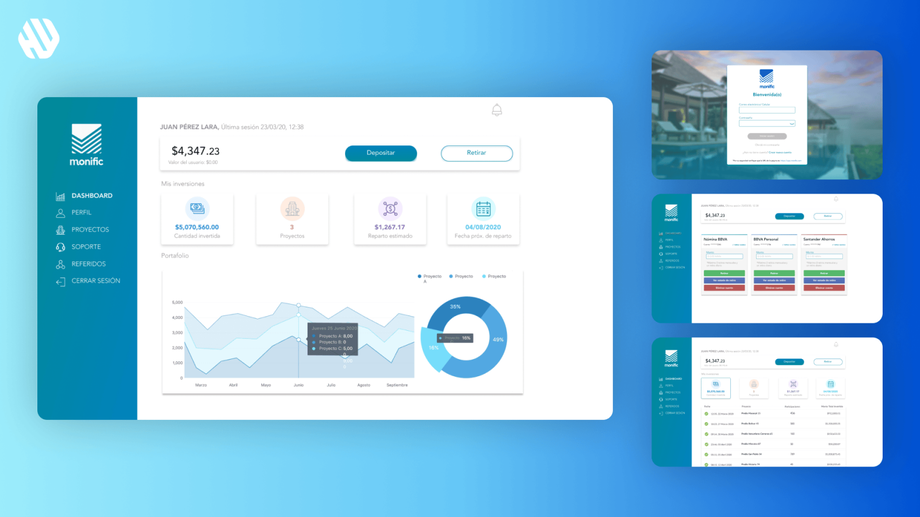
Revamped the Monific dashboard – improved user comprehension and engagement, leading to a 27% increase in monthly active users.
Understanding the Challenges and Objectives
Monific is a real estate crowdfunding platform that allows users to invest in properties with a minimum of $1,000 MXN. While the concept is appealing, the blend of Fintech and real estate poses challenges for users, particularly in understanding complex information. My goal was to create an intuitive user experience that demystifies investment processes and enhances user confidence.
The primary objectives for this project included:
- Simplifying complex financial and real estate terminology.
- Streamlining navigation to ensure users can easily find essential information.
- Providing timely updates on investment growth.
- Enhancing security features to foster trust in the platform.
A Structured Approach to User-Centered Design
🔍 Research
I conducted user interviews and analyzed existing user feedback to uncover pain points. I spoke with 15 users who had varying levels of experience with investment platforms. Key findings revealed that users struggled with understanding financial jargon, navigating the website, and felt anxious about security.
- Users reported confusion due to complex terminology.
- Navigation was often described as cumbersome and unclear.
- Many expressed frustration with slow updates on their investments.
- Security concerns were prevalent, affecting user trust.
✍️ Synthesis
In synthesizing the research, I identified recurring themes and created user personas representing typical Monific users. I also developed journey maps to visualize user interactions with the platform. These tools helped me pinpoint opportunities for improvement, particularly in simplifying language and enhancing navigation.
🎨 Design
My design approach focused on ideation through sketching and wireframing, followed by prototyping in Figma. I iterated on designs based on user feedback, ensuring that each version brought the experience closer to user needs. I prioritized clarity and accessibility, making sure users could easily navigate the dashboard and understand their investments.
🚀 Outcome
The final dashboard experience features a clean layout that prioritizes essential information. Users can effortlessly track their investments, receive prompt updates, and access educational resources that explain financial terms in simple language. The dashboard is designed to be intuitive, ensuring that users feel engaged and informed.
Rationale Behind Design Decisions
The decision to simplify language stemmed from user feedback highlighting confusion with complex terms. I focused on using plain English to make financial concepts accessible. This was critical, as many users expressed feeling overwhelmed by jargon.
To address navigation issues, I implemented a clear menu structure and prominent call-to-action buttons. This design choice was influenced by usability principles that emphasize the importance of intuitive navigation. Ensuring users could quickly find what they needed was paramount in building a positive user experience.
Measuring Success
The redesign of the Monific dashboard yielded measurable outcomes that demonstrated its effectiveness:
- 27% increase in monthly active users.
- 42% reduction in user-reported navigation issues.
- 35% faster access to investment updates.
- Positive feedback from users regarding improved clarity and security.
These results indicate that the redesign not only met user needs but also contributed to a more engaging and trustworthy investment experience.


