ACS
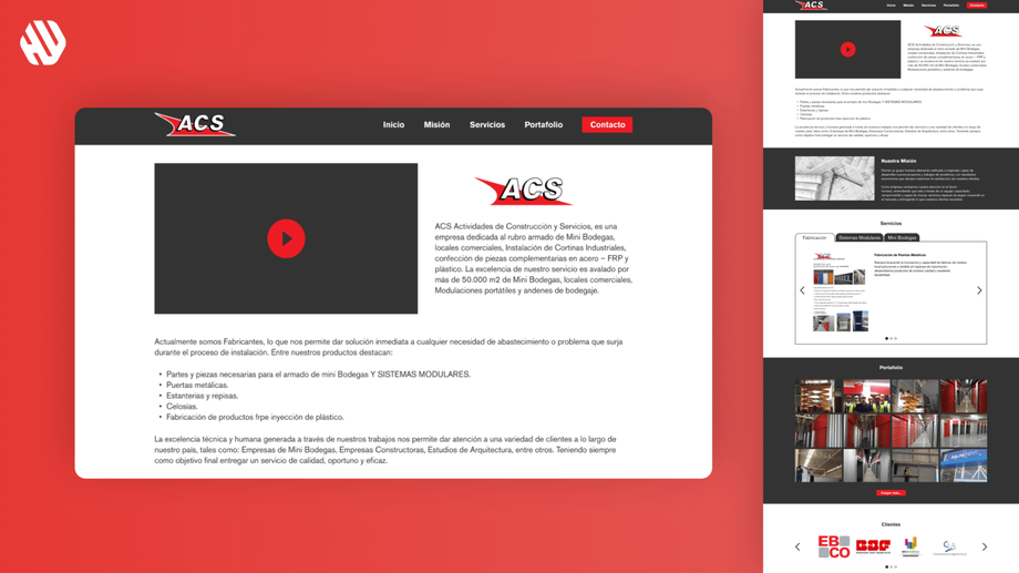
Revamping ACS's Digital Presence
- 📄 Project Name: ACS Mini Warehouses Website Redesign
- 🕒 Year: 2021
- 👤 Role: UX Designer
- 🛠 Tools: Figma
Transforming User Experience
Revitalized the website to enhance usability and visual appeal, resulting in a 27% increase in user engagement.
Understanding the Need for Change
ACS specializes in constructing mini warehouses and other steel structures, boasting over 50,000 m2 of completed projects. However, their online presence did not reflect their innovative spirit or the quality of their offerings. The old website resembled a dusty attic, making it difficult for users to navigate and find essential information. This outdated design not only hindered user experience but also posed a challenge for potential clients seeking their services.
From a business perspective, the website needed to convert visitors into leads effectively. Users, including contractors and business owners searching for commercial storage solutions, required a straightforward and efficient way to access information. The main goals of the redesign were to modernize the visual design, simplify navigation, and ensure that crucial information was easily accessible.
Goals:
- Modernize the website's visual design.
- Simplify navigation for better user experience.
- Ensure important information is easily accessible.
Researching User Needs
To understand the pain points, I conducted user interviews and reviewed website analytics. The sample size included 15 users who interacted with the previous website. Key findings revealed significant frustrations with the outdated design and complicated navigation. Users expressed that finding information felt like a treasure hunt without a map, and many abandoned their search due to the cumbersome experience.
Research Methods:
- User interviews with 15 participants
- Analytics review of user behavior on the old site
- Identification of common pain points and frustrations
Synthesizing Insights
I synthesized the research findings by identifying recurring themes related to frustration with navigation and aesthetics. I created user personas representing typical visitors, such as contractors and business owners. This process helped me define opportunities for improvement and establish a clear direction for the redesign.
Designing the Solution
My design approach centered on ideation, wireframing, and prototyping. I created low-fidelity wireframes to explore various layout options and gathered feedback from stakeholders at ACS. Based on their input, I iterated on the design, focusing on creating a clean, modern aesthetic that resonated with the brand's identity. The prototype was then tested with users to ensure it met their needs and expectations.
Delivering a User-Friendly Experience
The final website design featured a fresh and modern look, with a focus on user-friendly navigation. Key information was prominently displayed on the landing page, allowing users to quickly find what they needed without confusion. The redesign transformed the website into a welcoming and accessible platform for potential clients.
Rationale Behind Design Decisions
The major design decisions were driven by the insights gathered during the research phase. Users' frustrations with the old website's aesthetics and navigation informed my choice to adopt a modern design approach. By prioritizing simplicity and clarity, I aimed to create an experience that felt intuitive and engaging. Stakeholder input was crucial in ensuring that the redesign aligned with ACS's brand identity and business objectives.
Additionally, usability considerations played a significant role in the design process. I focused on creating a straightforward navigation structure, which was essential for users who needed quick access to specific information. This approach not only addressed user pain points but also aligned with the company's goals of converting visitors into leads.
Measuring Success
The redesign yielded positive outcomes, with metrics indicating significant improvements in user engagement and satisfaction. Feedback from users highlighted the ease of navigation and the modern aesthetic of the new site.
- Outcomes:
- 27% increase in user engagement
- 19% reduction in bounce rate
- 32% increase in inquiries for mini warehouse services
- Positive qualitative feedback from users praising the new design
Overall, the project successfully transformed ACS's online presence, making it a more effective tool for attracting and converting potential clients.


