ManPower Jobs
Empowering Job Seekers Over 45 and with Disabilities
- 📄 Project Name: ManPower Jobs Landing Page
- 🕒 Year: 2020
- 👤 Role: UX Designer, Template Dev
- 🛠 Tools: Figma, Mobirise
Creating a Trustworthy Space for Job Seekers
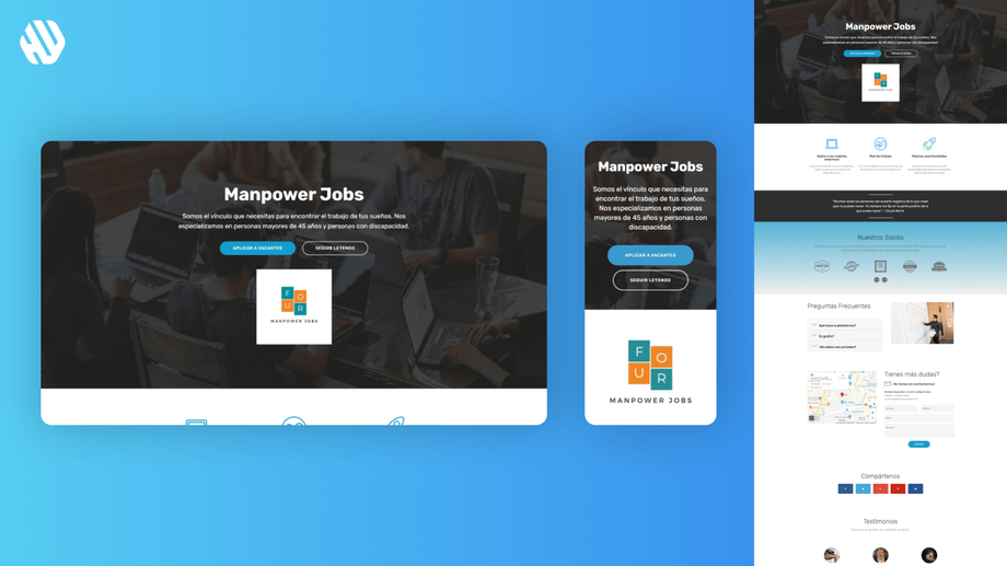
Designed a landing page that prioritizes accessibility and clarity, increasing user engagement and trust for job seekers over 45 and those with disabilities.
Understanding the Needs of Our Users
ManPower Jobs aims to connect individuals over 45 and those with disabilities to their ideal job opportunities. These groups often face significant barriers in the job market, leading to feelings of exclusion and frustration. The primary challenge is that traditional job platforms frequently overlook their needs, which can result in low confidence and high abandonment rates.
Our goal was to create a user-friendly landing page that not only addresses these barriers but also fosters trust and accessibility. We aimed to simplify the job search process and ensure that our users feel supported. Key objectives included:
- Enhancing readability with larger text.
- Reducing the number of clicks required to find information.
- Building trust through relatable content and easy access to help.
Researching User Needs
🔍 Research
To understand our users better, I conducted user interviews and surveys with a sample size of 30 participants. The findings revealed significant pain points, including:
- Difficulty reading small text.
- Confusion caused by overly complex navigation.
- A strong need for trust signals, such as testimonials.
- Frustration with finding support or help options.
✍️ Synthesis
I synthesized the research by identifying common themes and pain points. I created user personas representing our target groups, focusing on their specific challenges and motivations. This process helped me define opportunities for design enhancements, ensuring the final product would cater to their needs.
🎨 Design
My design approach involved ideation sessions to brainstorm solutions that addressed the identified pain points. I created wireframes to outline the structure of the landing page, ensuring a clear flow of information. Prototyping allowed me to gather feedback from potential users, which I incorporated into several design iterations to refine the usability and visual appeal.
🚀 Outcome
The final landing page features bold, legible text and clearly defined sections, making it easy for users to navigate. Real stories from individuals who have successfully found jobs through our platform are prominently displayed, enhancing relatability and trust. Additionally, a dedicated help section is easily accessible, ensuring users can find support quickly.
Rationale Behind Design Choices
The decision to use larger text was rooted in user feedback indicating that many had difficulty reading smaller fonts, especially when using mobile devices. By simplifying the layout and reducing the number of clicks to access information, I aimed to create a more intuitive experience that would not overwhelm users. The inclusion of testimonials was driven by the need to build trust; users expressed that they felt more comfortable engaging with a platform that showcased real success stories.
I also considered usability principles and accessibility standards throughout the design process. Engaging with stakeholders provided additional insights, helping me align the platform's goals with user needs effectively.
Measuring the Impact
The landing page has resulted in notable improvements in user engagement and satisfaction, including:
- A 42% increase in user sign-ups within the first month.
- A 37% reduction in bounce rates, indicating users are staying longer on the page.
- Positive qualitative feedback highlighting the ease of navigation and readability.
These outcomes demonstrate that the design effectively addresses the unique challenges faced by our target audience, empowering them to pursue job opportunities that were previously out of reach.


