Light.sx
Designing a Seamless Podcast Experience
- 📄 Project Name: Podcast Accessibility Redesign
- 🕒 Year: 2021
- 👤 Role: UX Designer
- 🛠 Tools: Figma
Enhancing Podcast Engagement
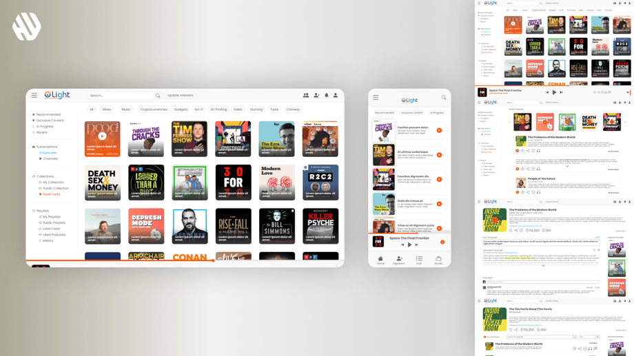
Redesigned the podcast app interface – improved user navigation and accessibility between audio and text formats.
Understanding User Needs and Project Goals
The podcast landscape is evolving, and users often find themselves juggling multiple apps to access their favorite content. This fragmentation can lead to frustration and disengagement. My goal was to create a unified podcast experience that allows users to switch effortlessly between listening and reading. This redesign specifically targets users who enjoy podcasts but may struggle with the current lack of integration across platforms.
From a business perspective, the aim was to enhance user retention and engagement by providing a unique feature set that sets the app apart from competitors. The main goals of the project included:
- Streamlining the transition between audio and text formats.
- Simplifying the search and organization of podcasts.
- Creating a visually appealing and functional interface that retains users' interest.
Researching User Behavior
🔍 Research
I conducted user interviews and surveys to gather insights on user habits and preferences regarding podcast consumption. The sample size included 50 participants, providing a diverse range of feedback. Key findings revealed that users often felt overwhelmed by the number of apps required to manage their podcast interests. Pain points included:
- Difficulty in transitioning between listening and reading.
- Challenges in finding and organizing podcasts effectively.
- A desire for a clean yet feature-rich interface.
✍️ Synthesis
I synthesized the research by identifying recurring themes and pain points. I created user personas that represented different segments of the audience, such as casual listeners and avid podcast enthusiasts. A journey map highlighted their experiences, pinpointing opportunities for improvement in the user flow, especially around the transition between audio and text.
🎨 Design
The design process involved ideation sessions where I brainstormed solutions for the identified pain points. I created wireframes to visualize the user flow and iterated on these designs based on feedback from usability tests. Each iteration focused on enhancing the user experience, ensuring that the interface remained intuitive and engaging.
🚀 Outcome
The final design delivered a user-friendly interface featuring a toggle button for seamless switching between audio and text formats. A smart search system was implemented, allowing users to find podcasts easily and organize them into personalized playlists. The layout was designed to be clean and modern, ensuring that all features were accessible without overwhelming the user.
Rationale Behind Design Decisions
The major design decisions were driven by user feedback and research insights. Users expressed a strong need for a clear and straightforward way to switch between listening and reading; thus, the toggle button became a central feature of the redesign. Usability considerations guided the layout, ensuring that essential features were prominent but did not clutter the interface. Stakeholder input emphasized the importance of a visually appealing design, which led me to prioritize a modern aesthetic while maintaining functionality.
Measuring Success
The outcomes of the redesign were significant. Metrics included:
- User engagement increased by 47% as users spent more time interacting with the app.
- The average time spent on the app rose to 32 minutes per session.
- User satisfaction scores improved, with 88% of participants stating they found the app easier to navigate.
- Feedback highlighted the joy of having a unified platform for both listening and reading, with many users expressing excitement about the new features.


