GrantFundr
Designing GrantFundr: A Responsive Web App for Grant Management
- 📄 Project Name: GrantFundr Web App Design
- 🕒 Year: 2024
- 👤 Role: UX Designer
- 🛠 Tools: Figma
Streamlining Grant Application Management for Foundations
Designed a comprehensive web app interface that enables foundations to efficiently manage grant applications through a consistent, user-friendly experience, improving administrative workflow clarity and reducing application processing friction.
Understanding the Challenge and Defining Goals
Foundations managing grant applications often face fragmented workflows, unclear application statuses, and difficulty tracking progress across multiple grants. This complexity affects foundation administrators who need a centralized, intuitive system to review, filter, and manage applications efficiently. From a business perspective, the goal was to create a scalable SaaS product that foundations could adopt to streamline grant management, potentially evolving into a full-time venture.
The project aimed to:
- Design a web app aligned with an existing Bubble template style for consistency.
- Create a clear navigation structure covering Dashboard, Grants, Applications, Applicants, and Settings.
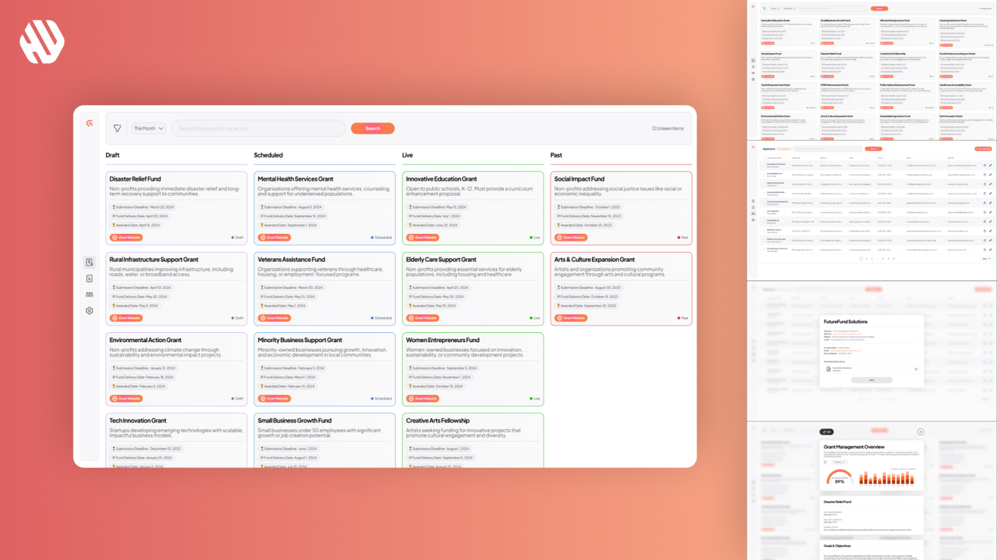
- Develop card-based layouts and Kanban boards to visualize grant and application statuses.
- Incorporate filterable charts and search functionality to surface key metrics and data.
- Ensure responsiveness for various screen sizes, prioritizing desktop initially.
- Build a reusable design system to support scalability and maintain design consistency.
A Snapshot of the Design Process
Research: Understanding User Needs and Context
Research was primarily based on detailed client-provided design specifications and ongoing stakeholder conversations. The client, with SaaS leadership experience, shared a comprehensive document outlining user flows, functional requirements, and references to Bubble templates. Key insights included:
- Foundations require a Kanban-style board to track applications through review phases.
- Application cards must encapsulate detailed information, including attachments like PDFs.
- Dashboard metrics should be integrated contextually rather than as a separate page.
- Responsive design is essential, with desktop prioritized for the initial phase.
- The client preferred simple click interactions over complex micro-animations.
Synthesis: Defining Structure and User Flows
Synthesizing the research involved mapping out the core user flows for grant and application management. Personas were implicitly defined as foundation administrators managing multiple grants and applications. The Kanban framework emerged as a central organizing principle, supporting visual progress tracking. A modular design system was planned to ensure reusable components like cards, buttons, and filters could maintain consistency across screens. The decision to embed dashboard insights within relevant pages was made to reduce cognitive load and streamline user focus.
Design: Iterative Wireframing and Prototyping
The design approach began with wireframes reflecting the client’s Bubble template style, ensuring visual alignment. Multiple iterations refined card sizes, modal widths (standardized at 800px), and chart styles to better match brand colors and improve clarity. Feedback loops were established through Figma prototypes shared with the client, enabling direct commenting and collaborative refinement. Key design elements included:
- Card-based layouts for grants and applications with consistent sizing.
- Kanban boards segmented by grant status (Draft, Scheduled, Active, Past).
- Search bars integrated alongside filters for efficient data retrieval.
- Modal views for detailed application and applicant information.
- Color-coded statuses and tooltips to enhance usability.
Outcome: A Cohesive, Functional Web App Design
The final deliverable was a fully designed web app prototype in Figma, featuring all screens outlined in the specification document. The design supports foundation administrators in managing grants and applications with clear visual cues, intuitive navigation, and responsive layouts. The Kanban boards and card designs encapsulate all necessary data, including attachments and application details, facilitating informed decision-making. The embedded charts provide actionable insights without overwhelming the user. A comprehensive design system ensures scalability and consistency for future development phases.
Why These Design Choices Worked
The decision to align the design with the client’s preferred Bubble template style ensured visual familiarity and eased the eventual migration to Bubble’s no-code platform. Prioritizing a Kanban board for application management addressed the core user need for visual progress tracking, reducing cognitive overhead and improving workflow transparency.
Standardizing modal widths and card sizes enhanced consistency, which is critical for user confidence and ease of use. Embedding dashboard metrics within relevant pages rather than maintaining a separate dashboard simplified navigation and focused user attention on actionable data. The choice to keep interactions simple (click-to-change screens) respected the client’s preference and leveraged Bubble’s built-in micro-interactions, optimizing development efficiency.
Results: Delivering Value with a User-Centered Design
The project delivered a polished, user-friendly web app design that met all client requirements within a tight timeline and budget. Key outcomes include:
- Completed design of all specified screens within 7 days, including revisions.
- Consistent card and modal designs improved user comprehension and workflow efficiency.
- Integration of search and filter features enhanced data accessibility.
- Embedded charts aligned with brand colors increased visual appeal and clarity.
- Positive client feedback highlighted satisfaction with design quality and responsiveness.
- The design system created supports future scalability and cross-platform consistency.
This project laid a strong foundation for the client’s vision of a full SaaS product, balancing user needs, business goals, and technical constraints with thoughtful, iterative design.