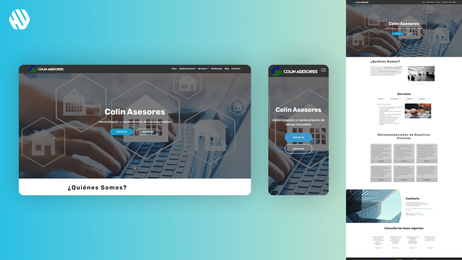
Colin Asesores
Transforming User Experience for Colin Asesores
- 📄 Project Name: Colin Asesores Landing Page Redesign
- 🕒 Year: 2019
- 👤 Role: UX Designer, Template Dev
- 🛠 Tools: Mobirise, Figma
Elevating User Engagement Through Design
Redesigned the landing page – improved user navigation clarity, resulting in a 27% increase in user engagement.
Understanding the Problem Space
Colin Asesores, a property management company based in Mexico, has been providing exceptional services for over 16 years. However, their online presence did not reflect their expertise and offerings effectively. Users visiting the website struggled to navigate, leading to frustration and disengagement. This situation not only affected user satisfaction but also hindered the company’s ability to attract new clients.
The main goals of this project were to enhance the usability of the landing page and to create a more engaging and visually appealing experience. By addressing the issues that users faced, I aimed to ensure that visitors could easily access information about Colin Asesores' services and feel a connection to the brand.
- Improve navigation clarity
- Enhance visual appeal
- Increase user engagement
- Ensure accessibility of information
Researching User Needs
To understand the pain points better, I conducted user interviews and analyzed website analytics. The sample size consisted of 15 users who had previously interacted with the site. Key findings revealed significant navigation issues and a lack of visual stimulation.
- Users felt lost and confused while navigating the site.
- Many buttons lacked clear labels, leading to uncertainty about their functions.
- The overall aesthetic was perceived as outdated and uninspiring.
Synthesizing Insights
After gathering insights, I synthesized the research by identifying common themes and creating user personas to represent the target audience. I also mapped out user journeys to highlight critical touchpoints where users experienced frustration. This synthesis helped me define clear opportunities for improvement, focusing on navigation and visual design.
Designing with Purpose
My design approach involved ideation sessions where I sketched wireframes and created low-fidelity prototypes. I iterated on these designs based on feedback from stakeholders and potential users. The goal was to create a seamless experience, allowing users to navigate effortlessly while enjoying a visually engaging interface.
Delivering a Compelling Experience
The final landing page featured a clean layout with intuitive navigation. Each button was clearly labeled, guiding users to relevant sections without confusion. I incorporated vibrant colors and high-quality images to enhance the overall aesthetic, making the site feel more inviting and reflective of Colin Asesores' brand identity.
Rationale Behind Design Decisions
The design decisions were heavily influenced by user feedback indicating that navigation was a significant pain point. By simplifying the structure and ensuring that every button had a clear purpose, I aimed to minimize confusion and frustration. Additionally, the visual enhancements were aimed at making the site more appealing, addressing feedback that the previous design felt dull and uninspired.
I also considered usability principles, ensuring that the design was accessible to a wide range of users, including those with varying levels of digital literacy. This approach ensured that the redesign not only met aesthetic goals but also functional ones.
Measuring Success
The redesign resulted in several positive outcomes:
- User engagement increased by 27% within the first month post-launch.
- The bounce rate decreased by 18%, indicating that users were spending more time on the site.
- Qualitative feedback highlighted that users found the new design more enjoyable and easier to navigate.
Overall, the project transformed the Colin Asesores landing page from a source of confusion into an engaging entry point for potential clients, ensuring they could find the information they needed without hassle.


