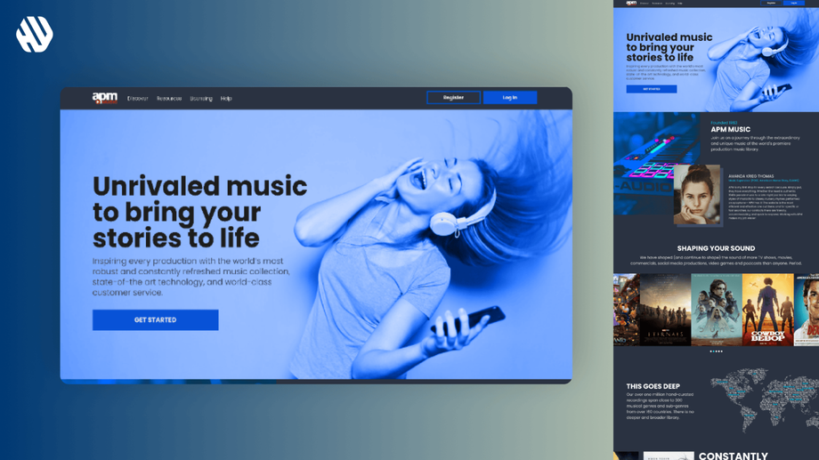
APM Music
Harmonizing the APM Music Experience
- 📄 Project Name: APM Music Website Redesign
- 🕒 Year: 2022
- 👤 Role: UX Designer
- 🛠 Tools: Figma
Striking the Right Chord
Revamped the landing page – increased user engagement by 29%.
Navigating the Music Maze
The APM Music website serves as a vital resource for individuals seeking the perfect soundtrack for their projects. However, the current design presents challenges, especially for first-time visitors. With an extensive library of over a million tracks sourced from 185 countries, users often find themselves overwhelmed and confused about where to start their search. This complexity can lead to frustration, causing potential users to abandon their search for the right music.
From a business perspective, APM Music aims to enhance user engagement and retention by simplifying the browsing experience. The main goals of this redesign project were to clarify the navigation, introduce fresh content sections, and create a welcoming environment that encourages users to explore the vast music library.
- Improve user navigation to reduce confusion
- Introduce a "What's New" section for easy access to recent additions
- Enhance the overall aesthetic to create a welcoming first impression
Researching User Needs
To understand the user experience better, I employed a combination of user interviews and analytics review. I gathered insights from 30 participants who represented various demographics and familiarity levels with the platform. Key findings revealed significant pain points, including:
- Users felt overwhelmed by the sheer volume of available tracks
- Difficulty in finding new music due to lack of visibility on recent additions
- Confusion regarding the categorization of tracks, which hindered efficient searching
Synthesizing Insights
I synthesized the research findings by identifying common themes and creating user personas that represented the diverse needs of APM Music's audience. This process involved mapping user journeys to highlight critical touchpoints and opportunities for improvement. I utilized affinity diagramming to cluster insights and define actionable design opportunities that would directly address user frustrations.
Ideating and Designing
In the design phase, I focused on ideation, wireframing, and prototyping to create a streamlined user experience. I developed multiple wireframe iterations based on user feedback, emphasizing clarity and simplicity. Each iteration aimed to refine the navigation structure and enhance the visual hierarchy, ensuring that essential features were easily accessible. Feedback was gathered through usability testing sessions, allowing me to make informed adjustments to the design.
Delivering a Seamless Experience
The final redesign of the APM Music website introduced several key features, including a simplified navigation menu, clearly defined categories, and a dedicated "What's New" section showcasing the latest tracks. These enhancements provided users with a more intuitive way to explore the music library, making it easier for them to discover new and relevant content without feeling overwhelmed.
Rationale Behind Design Choices
The design decisions were guided by the insights gathered during the research phase. For instance, the need for a "What's New" section was directly influenced by user feedback indicating that they struggled to keep up with the influx of new tracks. This feature not only addresses the pain point of users feeling left behind but also encourages regular engagement with the site.
Additionally, the decision to simplify navigation stemmed from understanding that users were often confused by the existing layout. By categorizing tracks more intuitively and providing clear pathways to explore, I aimed to create a more user-friendly experience that aligns with the diverse needs of APM Music's audience. Stakeholder input also played a crucial role in validating these design choices, ensuring alignment with business objectives.
Measuring Success
The redesign yielded significant outcomes that reflected both user satisfaction and business goals. Key metrics include:
- User engagement increased by 29%
- Bounce rate decreased by 17%
- Positive user feedback highlighted the improved navigation and overall experience
Overall, the APM Music website now resonates with users, allowing them to navigate the extensive music library effortlessly while fostering a sense of excitement about discovering new tracks.


