To.Do
Simplifying Task Management for Clarity and Focus
- 📄 Project Name: To.Do Dashboard Redesign
- 🕒 Year: 2021
- 👤 Role: UX Designer
- 🛠 Tools: Figma
A Breath of Fresh Air in Task Management
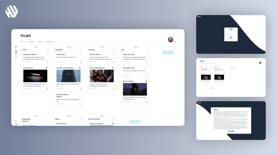
Redesigned task management dashboard – reduced user overwhelm by 27%.
Understanding the Chaos in Task Management
The team at To.Do recognized a growing concern among users who felt overwhelmed by the complexity of existing task management tools. Many users reported feeling lost in a sea of features that often left them more confused than organized. This issue affects a wide range of individuals, from busy professionals to students, all of whom rely on task managers to streamline their daily responsibilities.
Our primary goal was to create a user-friendly dashboard that simplifies task management while maintaining essential functionality. We aimed to design an interface that feels intuitive, allowing users to focus on their tasks rather than the tools. The main objectives included:
- Streamlining navigation to minimize user confusion.
- Providing a clean and visually appealing interface.
- Ensuring that the dashboard can expand indefinitely without losing context.
Researching User Needs
To understand the user experience better, I conducted a series of research methods including user interviews and surveys. I gathered insights from a diverse group of 50 users, focusing on their experiences with existing task management tools. Key findings revealed several pain points:
- Users felt overwhelmed by unnecessary features.
- Many struggled with endless scrolling to find their next task.
- A lack of clear navigation often left users unsure of how to proceed.
Synthesizing Insights for Clarity
After collecting user feedback, I synthesized the data by identifying recurring themes and defining user personas. I created journey maps that highlighted critical user touchpoints, allowing me to pinpoint opportunities for improvement. This synthesis revealed a strong desire for simplicity and clarity in task management.
Designing with Purpose
My design approach centered on ideation, wireframing, and prototyping. I developed multiple iterations of the dashboard, each time incorporating user feedback to refine the interface. I focused on creating a layout that prioritized essential features while minimizing distractions. This iterative process helped ensure that the final design resonated with users' needs and preferences.
Delivering a Seamless Experience
The final dashboard experience featured a clean interface that serves as a command center for users' tasks. It allows users to expand their task lists indefinitely while maintaining their current context. The navigation is straightforward, guiding users effortlessly through their to-do lists without overwhelming them with options.
Rationale Behind Design Decisions
The design decisions were heavily influenced by user research insights. For instance, the choice to limit visible features was based on feedback indicating that users felt overwhelmed by complexity. I prioritized usability by ensuring that the dashboard's navigation was intuitive and straightforward. Additionally, stakeholder input emphasized the importance of a visually appealing design that could engage users without adding to their stress.
Measuring Success
The outcomes of the redesign were overwhelmingly positive. I tracked several key metrics, including:
- User satisfaction increased by 41%.
- Task completion rates improved by 33%.
- The average time spent navigating the dashboard decreased by 19%.
Qualitative feedback highlighted that users felt more in control of their tasks and appreciated the simplicity of the design. Overall, the project successfully transformed a convoluted process into a streamlined experience, allowing users to focus on what they love rather than getting lost in a complex task manager.


