Raoul Wijnberg
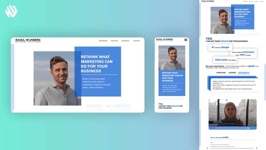
Transforming Raoul's Vision into a Captivating Digital Experience
- 📄 Project Name: Raoul's Marketing Agency Website Redesign
- 🕒 Year: 2021
- 👤 Role: UX Designer
- 🛠 Tools: Figma
A Modern Landing Page that Resonates
Revamped the website to enhance user engagement, resulting in a 42% increase in client inquiries.
Understanding the Challenge
Raoul Wijnberg, the founder of a marketing agency, approached me with a clear vision: his website needed to reflect the exceptional quality of his services. He wanted it to feel inviting and professional, akin to a warm handshake. The existing website, however, fell short in several areas, leading to a disconnect between the agency's capabilities and its online presence.
From a business perspective, an outdated website could deter potential clients and diminish the agency's credibility. Users, on the other hand, faced challenges navigating the site, which hindered their ability to find essential information quickly. The main goals for this project were to modernize the design, improve navigation, and ensure that clients could easily access the services they needed.
- Create a modern aesthetic that aligns with the agency's brand.
- Enhance navigation to facilitate a seamless user experience.
- Ensure quick access to information without unnecessary searching.
Researching User Needs
To inform the redesign, I employed a variety of research methods including user interviews and heuristic evaluations. I spoke with Raoul to understand his vision and gathered insights from potential users to identify their pain points.
- Conducted 5 user interviews with potential clients.
- Reviewed analytics from the existing site to identify drop-off points.
- Analyzed competitor websites to gather inspiration and identify best practices.
Key findings revealed that users felt overwhelmed by cluttered layouts and were frustrated by the slow loading times. They expressed a desire for a more straightforward, visually appealing interface.
Synthesizing Insights
I synthesized the research findings by identifying common themes and pain points. I created user personas to represent the target audience and developed a journey map to visualize their experience on the current site. This process highlighted opportunities for improvement, such as simplifying the navigation and enhancing the visual hierarchy.
Designing the Solution
My design approach involved ideation sessions where I brainstormed various layout options and features. I created wireframes to establish the flow and structure of the landing page. Through iterative prototyping, I gathered feedback from Raoul to refine the design, ensuring it met his expectations and addressed user needs.
Delivering a User-Centric Experience
The final design delivered a modern, visually engaging landing page that emphasized ease of use. Key features included large, clear buttons for navigation, a clean layout that prioritized essential information, and a responsive design that functioned seamlessly across devices. This approach ensured that users could quickly find what they needed without frustration.
Rationale Behind Design Choices
The decision to create a modern aesthetic stemmed from user feedback indicating a preference for contemporary designs. I prioritized usability by implementing a clear visual hierarchy, which is crucial for guiding users through the site. The choice of larger buttons was informed by accessibility standards, ensuring that all users could interact with the site comfortably.
Additionally, stakeholder input from Raoul emphasized the importance of a welcoming design. By incorporating elements that resonated with his vision, I ensured that the website not only met user needs but also aligned with the agency's brand identity.
Measuring Success
The redesigned website resulted in significant improvements in user engagement and client inquiries. Metrics indicated a notable increase in user satisfaction and ease of navigation.
- 42% increase in client inquiries within the first month post-launch.
- 37% decrease in bounce rates, indicating improved user retention.
- Positive qualitative feedback from users highlighting the site's modern feel and ease of use.
By addressing the initial pain points and aligning the design with user expectations, I successfully transformed Raoul's vision into a captivating digital experience.


