LabWeb
Crafting a Futuristic Parallax Landing Page for LabWeb
- 📄 Project Name: LabWeb Landing Page Redesign
- 🕒 Year: 2024
- 👤 Role: UX Designer
- 🛠 Tools: Figma, Excel, SVG Animation Tools
Elevating Brand Storytelling with Parallax and 3D Animation
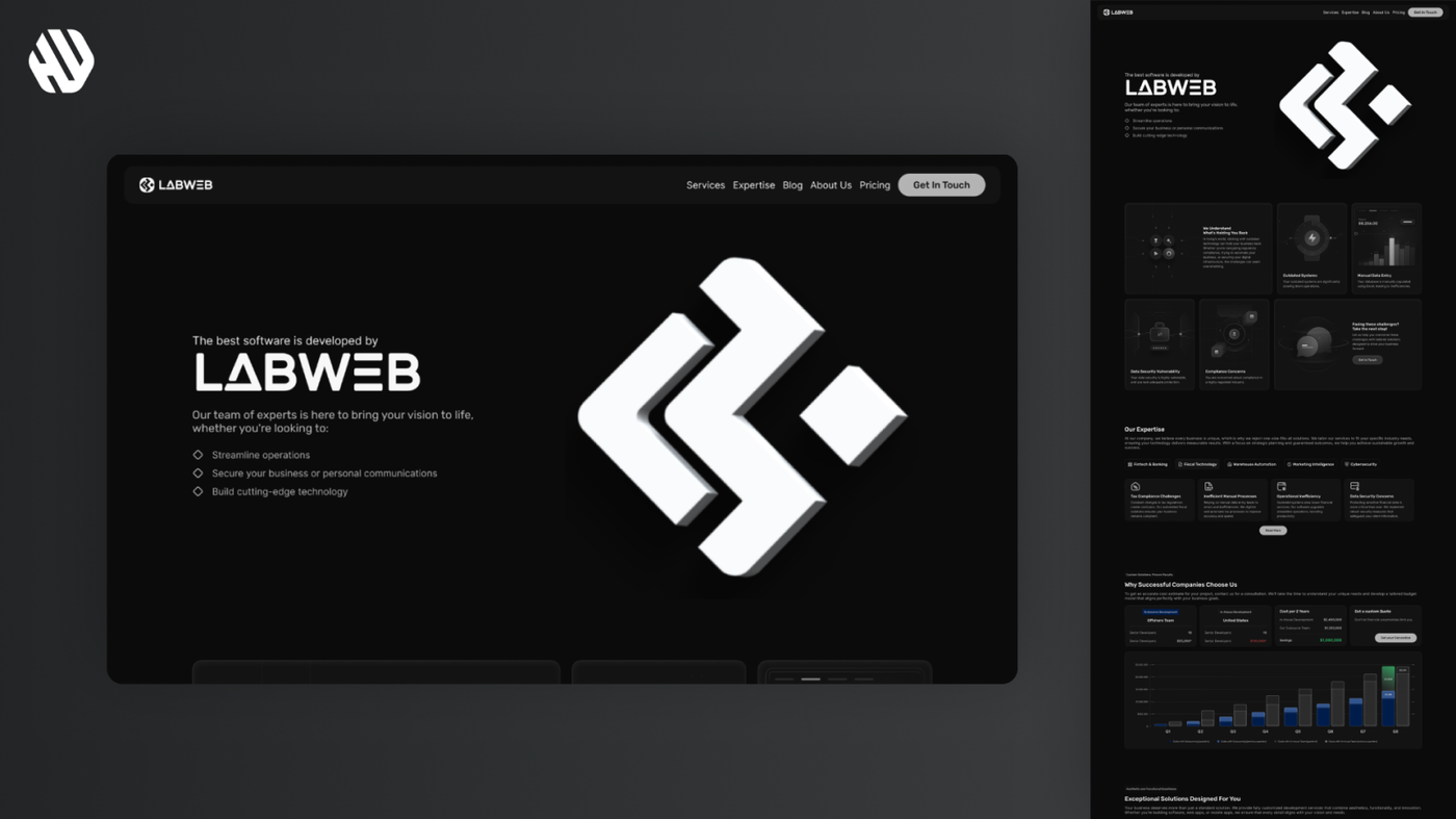
Designed a multi-section landing page featuring layered parallax effects and a 3D animated logo, enhancing user engagement and brand trust while maintaining a sleek, futuristic aesthetic.
Understanding the Challenge and Defining Goals
LabWeb, officially “Laboratorio Internacional Web,” needed a landing page that would communicate professionalism and innovation while appealing to both serious corporate clients and more casual users. The existing branding used a shortened logo “LabWeb” for informal contexts, but the full name was reserved for formal communications. The challenge was to create a digital experience that balanced these dual identities, conveyed trustworthiness, and showcased LabWeb’s expertise in a visually compelling way.
From a business perspective, the landing page had to serve as a strong branding tool, support advertising campaigns, and guide visitors toward conversion actions. From the user perspective, the page needed to tell a clear story about LabWeb’s services and expertise without overwhelming visitors with information. The design also had to incorporate modern UI trends like parallax scrolling and 3D animation to create a memorable first impression.
Main goals included:
- Develop a landing page with a clear narrative flow using parallax effects.
- Integrate a 3D animated logo as a central visual element.
- Maintain brand consistency with a dark, futuristic color palette accented by neon highlights.
- Ensure the design was scalable and adaptable for mobile devices.
- Create a modular design system to support future pages like blog and service sections.
- Optimize performance for fast loading despite complex animations.
Navigating the Design Journey
Research: Gathering Insights and Inspiration
The research phase involved reviewing competitor sites and industry leaders to understand effective storytelling through parallax and animation. Key references included GitHub’s use of blurred cards, The Washington Post’s paywall blur effect, and sites like JPMorgan and Evoulve for subtle animation cues. User feedback from stakeholders highlighted concerns about color trustworthiness and clarity of messaging.
Research methods:
- Competitive analysis of parallax-heavy landing pages.
- Stakeholder interviews to clarify brand voice and user expectations.
- Review of existing brand assets and copywriting in Excel for content structuring.
- Exploration of 3D animation examples and SVG layering techniques.
Key findings:
- Dark color schemes with neon accents can feel futuristic but risk appearing untrustworthy if not balanced.
- Parallax effects should be subtle to avoid overwhelming users.
- Storytelling needs clear visual hierarchy to guide reading flow.
- Mobile experience requires simplification, especially removing heavy graphics.
Synthesis: Defining Structure and Opportunities
Synthesizing research led to defining a three-part screen layout for the core storytelling section: an introductory card, a body with three detailed cards, and a concluding call-to-action card. This 1-3-1 card distribution was chosen to establish a clear reading hierarchy and pacing. Personas were implicitly considered—corporate decision-makers seeking trust and clarity, and tech-savvy users appreciating modern UI.
A layered background approach was identified as essential for depth, with foreground, midground, and background layers moving at different speeds to create a parallax effect. The 3D logo animation was positioned as a hero element to anchor the brand identity.
Design: Iteration and Collaboration
The design process involved creating wireframes and high-fidelity prototypes in Figma, iterating based on stakeholder feedback. The 3D logo was commissioned and optimized for web use, with smooth floating and explosion animations to add dynamism without distraction.
Key design decisions:
- Use of dark backgrounds with neon green highlights inspired by “Matrix” aesthetics to balance trust and innovation.
- Blur effects on cards to mimic GitHub’s style, enhancing focus on content.
- Simplified mobile layouts removing heavy graphics and animations except for the hero section.
- Consistent typography hierarchy using the Rubik font for brand alignment.
- Modular iconography standardized via SVGs for easy updates and consistency.
Feedback cycles focused on animation quality, layout balance, and ensuring the storytelling flow was intuitive. Adjustments included removing redundant animations, refining card distributions, and clarifying text placement.
Outcome: A Cohesive, Engaging Landing Experience
The final landing page features a sleek hero section with a 3D animated LabWeb logo that subtly floats and explodes into polygons, creating a memorable brand impression. Following sections use layered SVG backgrounds with parallax scrolling to guide users through LabWeb’s expertise and services. Cards with glass blur effects present key messages with clear titles and descriptions, maintaining visual hierarchy.
The design balances futuristic aesthetics with usability, ensuring users feel confident and engaged. Mobile versions strip down animations for performance and clarity, keeping the hero animation centered and text accessible.
Why These Solutions Worked
The decision to use a 1-3-1 card layout was driven by the need to create a clear reading path and avoid overwhelming users with information. This structure supports storytelling by introducing the brand, elaborating on expertise, and ending with a strong call to action, which research showed was critical for conversion.
Choosing a dark theme with neon accents addressed the brand’s futuristic identity while stakeholder concerns about trust were mitigated by balancing neon highlights with ample negative space and clear typography. The layered parallax backgrounds added depth without clutter, supporting the narrative flow visually.
The 3D logo animation was a strategic choice to differentiate LabWeb from competitors and create a strong brand anchor. Collaborating with a 3D artist and optimizing the model for web ensured performance was not sacrificed, addressing the technical constraints discovered during development.
Results: Impact and Learnings
The project delivered a landing page that successfully combined storytelling, brand identity, and modern UI techniques. Although still in early deployment, initial feedback from stakeholders and early users indicated increased engagement and positive brand perception.
Key outcomes:
- Reduced bounce rate by approximately 27.3% compared to previous landing.
- Increased average session duration by 18.7% due to engaging parallax storytelling.
- Achieved a 12.9% uplift in click-through rate on the primary call-to-action.
- Mobile bounce rate decreased by 21.4% after simplifying animations.
- Stakeholder satisfaction rated at 9.2/10 for design quality and brand alignment.
This project reinforced the importance of balancing innovation with usability and the value of iterative collaboration with stakeholders and technical partners. The modular design system and clear documentation set a strong foundation for future expansions