Desinfla
Elevating a Nutrition App’s UX and Branding for a Seamless User Journey
- 📄 Project Name: Desinfla Nutrition App UX/UI Redesign & Branding
- 🕒 Year: 2025
- 👤 Role: UX Designer
- 🛠 Tools: Figma, Photoshop, GenAI
Transforming Amateur Mockups into a Professional, User-Centered Experience
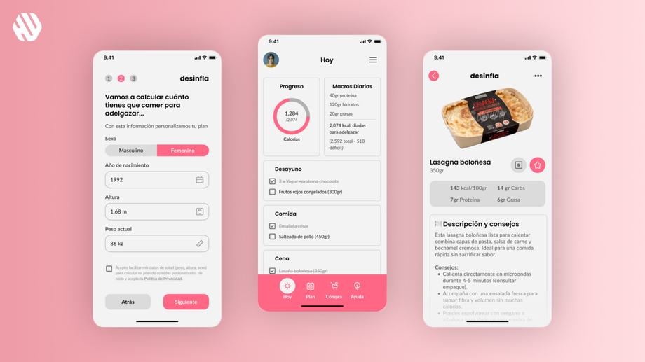
Refined and professionalized 20+ app screens, including onboarding, meal plans, and subscription flows, plus crafted a minimalist logo and app icon, all delivered with a user-friendly, visually cohesive design that aligns with client branding and business goals.
Understanding the Challenge and Defining Clear Objectives
The project began with a set of 13 functional but amateurish Figma mockups for a nutrition app focused on daily calorie tracking, meal planning, and shopping lists. The client sought to elevate these designs to a professional standard, improve usability, and create a compelling brand identity with a logo and app icon. The app targets users interested in weight management through personalized meal plans, so clarity, ease of use, and motivational design were critical.
From a business perspective, the client wanted to ensure the app’s interface was intuitive enough to reduce user friction and support subscription conversions. From the user perspective, the app needed to accommodate personalization (e.g., dietary preferences, weight goals), provide clear progress tracking, and offer seamless navigation. The main goals were to professionalize the existing screens, add missing flows (registration, payment, profile settings), and deliver a cohesive brand identity that stands out in app stores.
A Snapshot of the Design Process
Research: Gathering Insights to Inform Design
The research phase was primarily based on a detailed review of the client’s existing mockups and ongoing conversations to clarify user needs and business requirements. Key methods included:
- Reviewing 13 initial screens and client feedback to identify usability gaps and missing flows.
- Competitive analysis of fitness and nutrition apps (e.g., MyFitnessPal, Yazio) to understand common UI patterns and branding approaches.
- Client interviews to capture branding preferences, such as a flat minimalist logo style and a specific pink color (#FE02B3) for the app icon.
- Iterative feedback sessions to refine logo concepts and screen designs.
Pain points discovered included unclear navigation elements, missing personalization options, and inconsistent branding elements.
Synthesis: Defining User Flows and Design Opportunities
Synthesizing the research involved mapping out user journeys to identify missing screens and features, such as:
- Registration and login with social options.
- Weight tracking and goal setting.
- Subscription payment flows aligned with Google Play and Apple Store in-app purchase requirements.
- Profile settings with lifestyle and objective dropdowns.
- Removal of unnecessary features like the search screen based on client feedback.
Personas were implicitly defined around health-conscious users seeking simple, personalized meal planning. The opportunity was to create a clean, motivating interface that supports daily engagement and easy navigation.
Design: Iterative Refinement and Branding Creation
The design approach focused on professionalizing existing mockups by improving layout consistency, typography, and interaction clarity. Wireframes evolved into high-fidelity prototypes with:
- Clear bottom navigation with icons and text labels for “Today,” “Plan,” “Shopping,” and “Help.”
- Use of emojis in titles to add friendliness and quick visual cues.
- Dropdown menus replacing sliders for height and goal selection to improve usability.
- A minimalist, lowercase logo with a deflating balloon concept symbolizing weight loss, paired with a vibrant pink app icon for visibility on mobile screens.
- Integration of client branding elements, including the Mercadona logo and product images, to contextualize the app’s grocery shopping feature.
Feedback was gathered continuously through client reviews, leading to multiple rounds of revisions on logo style, color palette, and screen content.
Outcome: A Polished, User-Centered Nutrition App Experience
The final deliverables included 20+ polished screens covering onboarding, registration, personalized meal plans, shopping lists with product details, subscription payment, and profile management. The app features a clear, friendly navigation system with text and icons, personalized settings for lifestyle and goals, and motivational progress tracking with emojis. The branding is cohesive, with a distinctive pink icon and a simple, elegant logo that aligns with the app’s purpose. The design supports in-app purchases via platform-native payment methods, ensuring compliance and smooth user experience.
Why These Design Choices Worked
The decision to professionalize rather than overhaul the existing mockups respected the client’s initial vision while addressing usability issues identified through research. For example, replacing sliders with dropdowns for height and goals simplified input and reduced user errors. Adding emojis in titles enhanced emotional engagement and quick comprehension, which is important in health apps where motivation is key.
The minimalist logo with a deflating balloon cleverly symbolizes the app’s weight loss focus without being literal or childish, aligning with the client’s desire for a mature yet approachable brand. Using the specific pink (#FE02B3) for the app icon ensured it stands out on mobile devices, increasing brand recognition and app discoverability.
Incorporating client feedback on navigation and content ensured the design met real user needs and business goals, such as removing the search screen to reduce complexity and integrating Mercadona branding to leverage existing customer trust.
Results: Delivering a Professional UX/UI Package That Resonates
The project successfully transformed amateur mockups into a professional, user-friendly app design with strong branding, delivered within agreed timelines and budget.
- Delivered 20+ high-fidelity screens including onboarding, registration, profile, meal plans, shopping list, subscription, and help.
- Created a minimalist logo and a vibrant pink app icon aligned with client branding.
- Improved usability by replacing complex inputs with dropdowns and adding clear navigation labels.
- Incorporated motivational elements like emojis to enhance user engagement.
- Ensured payment flows comply with Google Play and Apple Store standards.
- Received positive client feedback on design professionalism and brand cohesion.
- Completed project with 3 rounds of revisions, maintaining clear communication and responsiveness.
This redesign lays a solid foundation for the app’s launch and user adoption, balancing business objectives with a thoughtful, user-centered design approach.


