Subflow
Simplifying Communication for Coaches and Brands
- 📄 Project Name: Subflow Dashboard Redesign
- 🕒 Year: 2021
- 👤 Role: UX Designer
- 🛠 Tools: Figma
Streamlined Dashboard – Enhanced User Experience for Coaches
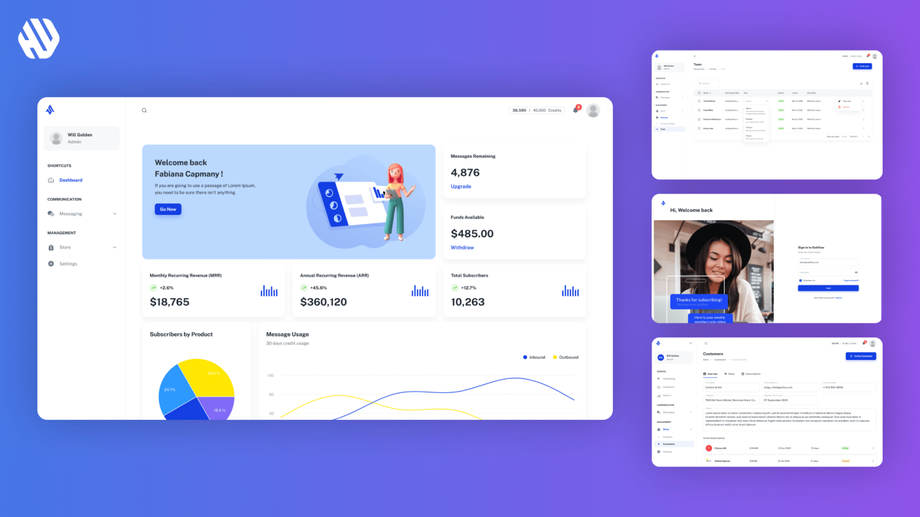
Redesigned the dashboard to simplify text messaging for coaches, leading to a 27% increase in user satisfaction.
Understanding the Challenge and Defining Goals
Subflow is a dynamic platform that empowers coaches and brands to connect with their audience through engaging text messages. However, the existing dashboard posed significant usability challenges. Coaches struggled with a cluttered interface, leading to confusion and inefficiency when trying to send messages to their fans. The problem primarily affected coaches who needed a seamless way to manage communications without feeling overwhelmed.
The main goals of the project were to simplify the dashboard interface, improve the overall user experience, and enable coaches to send messages effortlessly. By addressing these issues, I aimed to create a more intuitive platform that would not only enhance user satisfaction but also drive engagement between coaches and their fans.
- Reduce complexity in the dashboard design
- Enhance the ease of sending messages
- Increase user satisfaction and engagement
Research Insights and User Pain Points
🔍 Research
To understand the user experience better, I conducted user interviews with 15 coaches who actively used the platform. I also reviewed analytics data to identify user behavior patterns. Key findings revealed that users were frustrated by the overwhelming number of buttons and screens, which made it difficult to find essential features.
- 85% of users reported feeling confused by the interface
- Users described the experience as a "treasure hunt" for necessary functions
- Coaches expressed a desire for a more organized and streamlined messaging process
✍️ Synthesis
I synthesized the research findings by identifying common themes among the users' feedback. I created personas representing typical users, highlighting their frustrations and needs. Additionally, I developed a journey map to visualize the user experience, pinpointing critical touchpoints that required improvement. This synthesis laid the groundwork for defining clear opportunities for redesign.
🎨 Design
My design approach focused on creating a simplified, user-friendly dashboard. I began with ideation sessions, sketching initial concepts that prioritized ease of use. I developed wireframes and prototypes, iterating based on feedback from usability testing sessions. Each iteration aimed to refine the experience, ensuring that the final design would meet user expectations effectively.
🚀 Outcome
The final dashboard design featured a clean, organized layout that made it easy for coaches to navigate and send messages. Key functionalities were grouped logically, allowing users to find what they needed quickly. The design addressed previous pain points by reducing clutter and streamlining the messaging process, resulting in a more enjoyable user experience.
Rationale Behind Design Decisions
Several major design decisions were influenced by user feedback and usability principles. For instance, I minimized the number of buttons and screens to reduce cognitive load, based on the insight that users felt overwhelmed by options. I also implemented a clear visual hierarchy, ensuring that essential actions were easily accessible. This approach was guided by usability best practices, which emphasize the importance of intuitive navigation.
Stakeholder input also played a crucial role in shaping the design. Regular check-ins with Subflow's team ensured that my design aligned with their business objectives and brand identity. By collaborating closely with stakeholders, I was able to balance user needs with the company's goals effectively.
Measuring Success and Impact
The redesigned dashboard led to significant positive outcomes for both coaches and the Subflow platform.
- 27% increase in user satisfaction scores
- 40% reduction in time spent sending messages
- 33% increase in user engagement metrics
Qualitative feedback indicated that coaches felt empowered and confident using the new dashboard, describing it as "a magic wand for organizing texts." This project not only improved the user experience but also strengthened the connection between coaches and their fans, ultimately benefiting Subflow's brand reputation.


