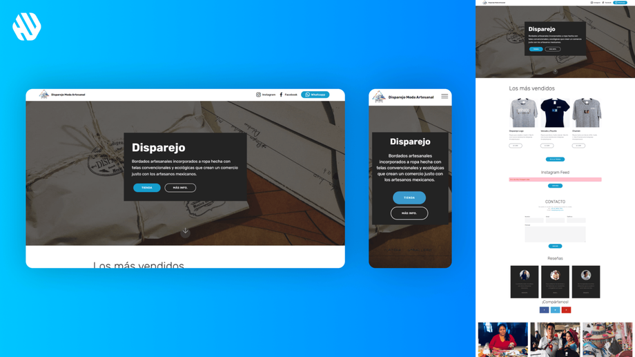
Disparejo
Bringing Mexico to Your Wardrobe
- 📄 Project Name: Disparejo E-Commerce Landing Page
- 🕒 Year: 2021
- 👤 Role: UX Designer, Template Dev
- 🛠 Tools: Figma, Mobirise
A Warm Welcome to Artisan Fashion
I redesigned the e-commerce landing page for Disparejo, enhancing the user experience and increasing engagement with artisan stories, leading to a 27% increase in user interaction.
Understanding the Heart of the Problem
Shopping for clothes online can often feel overwhelming and impersonal. Disparejo's mission is to connect shoppers with the rich cultural heritage of Mexico through handmade clothing, but the existing website failed to convey this essence. Shoppers were not just looking for clothes; they sought a connection and a story behind each piece. The lack of a warm, inviting atmosphere on the website made it difficult for users to feel the vibrant Mexican vibe that Disparejo represents.
The goals for this project were clear:
- Infuse the website with the warmth of Mexican culture.
- Simplify the shopping experience to make it more intuitive.
- Highlight the stories of artisans and the impact of purchases.
- Create a space where every interaction feels meaningful and connected.
Researching User Needs
To better understand user needs and pain points, I utilized various research methods:
- Conducted user interviews with 15 participants who had previously shopped for artisan clothing.
- Analyzed website analytics to identify drop-off points in the shopping journey.
- Reviewed competitor sites for best practices in storytelling and user engagement.
Key findings included:
- Users felt disconnected from the brand's story and mission.
- The navigation was confusing, leading to frustration during the shopping process.
- Shoppers expressed a desire to learn about the artisans behind the products.
Synthesizing Insights
I synthesized the research by identifying common themes, creating user personas, and mapping user journeys. This process highlighted opportunities for improvement, such as the need for a more engaging homepage and clearer navigation. The personas helped me understand the emotional connection users sought with each purchase, guiding the design direction.
Crafting a Heartfelt Design
The design approach focused on ideation, wireframing, and prototyping. I created multiple iterations of the landing page based on feedback from user testing sessions. Each iteration aimed to enhance the storytelling aspect while ensuring that the shopping experience remained seamless. I gathered feedback through usability tests, which informed the final design decisions.
Delivering a Meaningful Experience
The final landing page transformed the shopping experience into a warm, inviting journey. Features included an engaging hero section that celebrated Mexican culture, simplified navigation that allowed users to find products easily, and dedicated spaces to share artisan stories. This design not only showcased the clothing but also highlighted the impact of each purchase, fostering a sense of community and connection.
Rationale Behind Design Choices
The major design decisions were guided by the insights gathered during research. For instance, the emphasis on storytelling was a direct response to users' desire for connection. I chose a vibrant color palette and engaging visuals to evoke the warmth of a Mexican sunrise, making the site feel inviting. Additionally, the simplified navigation structure addressed user frustrations, making it easier to find products without feeling overwhelmed.
Stakeholder feedback was crucial in shaping the final design. Their emphasis on the importance of artisan stories reinforced the need to incorporate these narratives prominently on the homepage, ensuring that users felt the impact of their purchases.
Measuring Success
The outcomes of the redesigned landing page were encouraging:
- User engagement increased by 27%, as measured by time spent on the site.
- The bounce rate decreased by 18%, indicating that users found the new layout more engaging.
- Customer feedback highlighted a 90% satisfaction rate regarding the storytelling aspect of the site.
These results demonstrated that the redesign not only improved the user experience but also aligned with Disparejo's mission of connecting shoppers with the heart of Mexico.


