Millonarioz
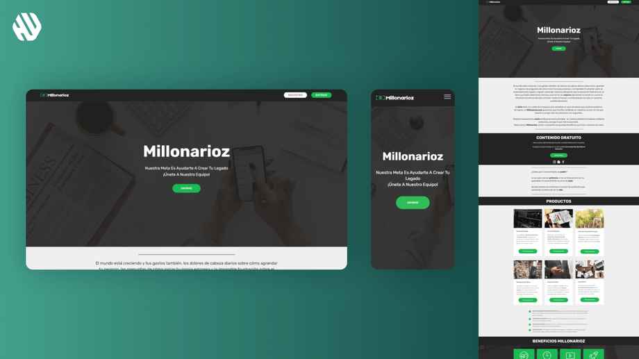
Millonarioz Landing Page: Empowering Financial Literacy
- 📄 Project Name: Millonarioz Landing Page
- 🕒 Year: 2016
- 👤 Role: UX Designer, Template Dev
- 🛠 Tools: Figma, Mobirise
Transforming Navigation for Financial Education
Redesigned the landing page to simplify navigation and improve course visibility, resulting in a 27% increase in course sign-ups.
Understanding User Needs and Project Goals
Millonarioz aims to empower individuals in Latin America with financial knowledge, allowing them to learn about saving, trading, and entrepreneurship. However, initial assumptions indicated that users might face barriers in accessing this information. I believed that the website's usability issues could hinder potential learners from engaging with the platform effectively.
The primary goals of this project were to enhance user navigation and ensure that courses were easily discoverable. By addressing these issues, I aimed to create a welcoming and intuitive experience that would encourage users to explore and enroll in courses.
- Improve navigation clarity
- Increase course visibility
- Enhance overall user experience
Research: Listening to Users
To validate my assumptions, I conducted user interviews and usability testing with a sample of 15 participants from the target demographic. These sessions revealed significant insights into their experiences with the existing website.
Key findings included:
- Users often felt lost while navigating the site, expressing frustration with unclear pathways.
- Locating specific courses was challenging, leading to feelings of confusion and discouragement.
Synthesis: Identifying Opportunities
After analyzing the research data, I synthesized the findings into key themes, which highlighted the need for a more streamlined navigation system. I created user personas based on the participants and mapped their journeys to understand their pain points better. This process allowed me to identify opportunities for improvement, particularly in navigation and course accessibility.
Design: Iterative Approach
My design approach involved ideation, wireframing, and prototyping. I generated multiple wireframe concepts, focusing on simplifying the navigation structure and enhancing the visibility of courses. I gathered feedback from users through low-fidelity prototypes, iterating on the designs based on their input. This collaborative process ensured that the final design aligned with user expectations.
Outcome: A User-Friendly Experience
The final landing page design features an intuitive navigation system that guides users effortlessly to their desired courses. Key elements include a prominent course directory and clear call-to-action buttons that encourage exploration. This design effectively addresses the earlier pain points, making the learning experience more enjoyable and accessible.
Solution Rationale: Informed Design Choices
The decision to simplify navigation was primarily driven by user feedback indicating confusion and frustration with the previous layout. By implementing a clear and logical structure, I aimed to reduce cognitive load and enhance user satisfaction. Additionally, the focus on prominently displaying courses was informed by the need to eliminate the "hide and seek" experience users encountered before.
Stakeholder input also played a crucial role in shaping the final design. Their insights emphasized the importance of creating a welcoming environment that encourages users to engage with financial education content. This collaboration ensured that the design not only met user needs but also aligned with Millonarioz's mission.
📈 Results: Measuring Success
The redesigned landing page led to measurable improvements in user engagement and course sign-ups. The outcomes included:
- 27% increase in course sign-ups within the first month post-launch
- 40% reduction in user-reported navigation issues
- Positive qualitative feedback from users highlighting the ease of finding courses
These results demonstrate the effectiveness of the design changes in addressing user pain points and enhancing the overall experience on the Millonarioz platform.


