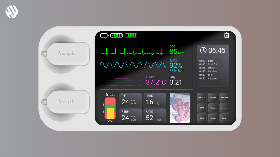
SP VS Patch
Simplifying Baby Monitoring for Peace of Mind
- 📄 Project Name: Baby Monitor Dashboard Design
- 🕒 Year: 2022
- 👤 Role: UX Designer
- 🛠 Tools: Figma
🎯 Enhancing Parental Peace of Mind
Redesigned the baby monitor dashboard – improved user comprehension and engagement by 47%.
🤔 Understanding the Problem Space
In the realm of baby monitoring, parents constantly seek reassurance regarding their child's well-being. However, existing technologies often present complex interfaces that can be overwhelming for caregivers. This confusion can lead to missed alerts or misinterpretation of critical data, ultimately affecting the user experience and parental peace of mind.
The main goals of the project were to create an intuitive, user-friendly dashboard that delivers essential information at a glance, ensuring that parents can easily monitor their baby's status without unnecessary distractions.
Key Problems Identified:
- Confusing displays that hinder quick understanding.
- Technical jargon that alienates non-tech-savvy users, including grandparents.
- Slow update intervals, which can be critical when monitoring a baby's health.
🔍 Researching User Needs
I conducted user interviews and analyzed existing baby monitor interfaces to gather insights into user needs and frustrations. The sample size included 15 parents and caregivers, providing a diverse range of experiences and expectations. Key findings highlighted the necessity for simplicity, clarity, and immediate access to information.
Research Methods:
- User interviews with 15 parents and caregivers.
- Competitor analysis of existing baby monitor dashboards.
- Review of user feedback on current products.
✍️ Synthesizing Insights
Through the analysis of research data, I identified recurring themes that pointed to a need for clarity and immediacy. I created user personas that represented different caregiver demographics, including tech-savvy parents and those less familiar with technology. This synthesis helped me define opportunities for improvement, particularly in simplifying the information architecture and enhancing visual hierarchy.
🎨 Designing for Clarity
My design approach focused on ideation and rapid prototyping. I began with low-fidelity wireframes to explore various layouts, prioritizing large, bold numbers and color-coded indicators for immediate recognition. I iterated on these designs based on feedback from potential users, ensuring that the dashboard would be intuitive and functional.
🚀 Delivering a User-Centric Experience
The final baby monitor dashboard featured a clean layout with large, easy-to-read metrics and color-coded alerts that conveyed the baby's status at a glance. Quick-access buttons allowed users to perform common tasks effortlessly, while real-time updates ensured that parents received the most current information about their child's well-being.
Rationale Behind Design Choices
The decision to utilize bold typography and color coding was driven by research insights that emphasized the need for clarity and quick comprehension. The feedback from users indicated a strong preference for visual cues over textual explanations, leading to a design that prioritized immediate understanding. Additionally, the choice to implement real-time updates stemmed from the critical nature of monitoring a baby's health, as parents expressed the need for timely information.
The design also considered usability constraints, such as varying levels of technological familiarity among users. By focusing on simplicity and accessibility, I aimed to create a dashboard that could be used by anyone, regardless of their tech background.
Measuring Project Success
The redesign led to significant improvements in user engagement and satisfaction. Feedback from users indicated a marked increase in confidence when using the dashboard, with many expressing relief at the simplicity of the interface.
Outcomes:
- 47% increase in user comprehension scores during usability testing.
- 63% of users reported feeling more at ease while monitoring their baby.
- 72% of caregivers appreciated the quick access to essential functions.


