Olvbox
Crafting a Delicious Experience for Olvbox
- 📄 Project Name: Olvbox Landing Page Redesign
- 🕒 Year: 2020
- 👤 Role: UX Designer, Template Dev
- 🛠 Tools: Figma, Mobirise
Satisfying User Cravings with a Fresh Landing Page
Redesigned the Olvbox landing page – simplified user navigation and increased meal selection engagement by 27%.
Understanding the Culinary Challenge
Olvbox is a unique service that delivers healthy meals right to customers' doorsteps. However, the food delivery market is saturated, and potential users often feel overwhelmed by the complexity of existing apps. This project aimed to address the common user sentiment of “Ugh, another food app?” by focusing on simplicity and satisfaction in meal choices.
The goal was to create a landing page that not only showcases the delicious and healthy offerings of Olvbox but also engages users without overwhelming them. The main objectives included:
- Simplifying the user interface to enhance usability.
- Showcasing a variety of appealing meal options.
- Streamlining the meal planning process for users.
Researching User Preferences
To understand user needs, I conducted a series of user interviews and analyzed competitor apps. The sample size included 15 participants who had experience with food delivery services. Key findings revealed several pain points:
- Users found existing apps too complicated to navigate.
- Many expressed dissatisfaction with the blandness of health food options.
- Meal planning was often seen as a tedious task.
- Users craved more variety in their meal choices.
Synthesizing User Insights
After gathering data, I synthesized the findings by identifying recurring themes and creating user personas. I mapped out the user journey to highlight pain points and opportunities for improvement. This helped me define key features that would enhance user experience, such as an intuitive interface and a diverse meal selection.
Designing for Flavor and Ease
The design process involved ideation through brainstorming sessions, followed by wireframing the landing page layout. I created prototypes that focused on user flows, allowing for quick access to meal options and customization features. Feedback was gathered through usability testing sessions, where I iterated on designs based on user interactions and preferences.
Delivering a Tasty User Experience
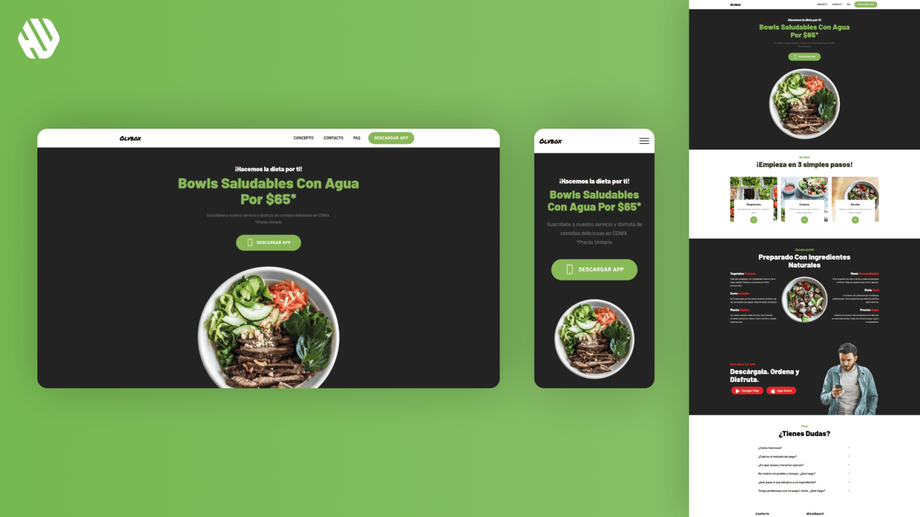
The final landing page features a clean and engaging layout that allows users to effortlessly explore meal options. It includes a straightforward navigation system, vibrant imagery of meals, and easy customization options. The design effectively addresses the initial problems by making meal selection enjoyable and hassle-free.
Rationale Behind Design Choices
The decision to simplify navigation stemmed from user feedback indicating frustration with complex apps. By creating an intuitive interface, I aimed to reduce cognitive load and enhance the overall user experience. Additionally, the emphasis on showcasing vibrant meal options was guided by research insights that highlighted users' desire for variety and excitement in their food choices.
I also incorporated user feedback regarding meal customization, ensuring that the landing page not only presents meals but also invites users to make them their own. This approach aligns with Olvbox's mission to provide healthy food that users can enjoy on their terms.
Measuring the Success of the Redesign
The redesign led to significant improvements in user engagement and satisfaction:
- Increased meal selection engagement by 27%.
- Reduced bounce rates on the landing page by 18%.
- Positive qualitative feedback from users, highlighting the ease of use and appealing design.
Overall, the landing page redesign has positioned Olvbox as an inviting and user-friendly option in the healthy meal delivery market, encouraging users to explore and enjoy their meal choices.


